Culture-aware UX patterns: Designing for global audiences
A German user lands on your SaaS onboarding screen. The translation is technically correct. But the tone is too casual, the date format is wrong, and the call-to-action button is red, a color that, in this context, reads as danger rather than urgency. The user hesitates. The hesitation becomes a drop-off.
This is the gap that culture-aware UX fills.
Translation converts words. Localization adapts the product. But culture-aware design goes one step further: it considers how users from different cultural backgrounds experience your interface, including what they expect, what they trust, and what instinctively feels off.
This post covers the most impactful culture-aware UX patterns, with concrete examples for each, so your product feels intentional in every market you enter.
If you're building the strategic foundation first, see the localization strategy guide for a broader framework. For the technical side: RTL layouts, text expansion, locale-aware formatting, the complete i18n guide covers the implementation details.
What "culture-aware" actually means in UX
Cultural context shapes user expectations in ways that go beyond language. Two users reading the same translated sentence can have very different reactions depending on:
- The formality level of the language
- The colors and iconography surrounding it
- Whether the layout matches their reading direction
- Whether the information hierarchy matches their decision-making style
- Whether trust signals are appropriate for their market
Anthropologist Geert Hofstede identified several cultural dimensions that turn out to be directly relevant to UX: individualism vs. collectivism, power distance, uncertainty avoidance, and long-term vs. short-term orientation. You do not need to study the academic framework, but the underlying insight matters: people from different cultures use interfaces differently, not because they are less sophisticated, but because their expectations were formed in different contexts.
The good news is that most cultural UX differences cluster into a handful of patterns that are practical to design for.
Tone and formality
One of the most immediately felt cultural differences is whether your product speaks to users formally or informally. This is not just a translation decision. It is a design decision that shapes the entire voice of your product in a given market.
German and Japanese users generally expect formal address. In German, the distinction between "du" (informal) and "Sie" (formal) carries real social weight. A SaaS product addressing business users in Germany with the informal "du" can read as presumptuous or insufficiently professional. Many German SaaS companies, including enterprise tools, default to "Sie" and only shift to "du" after the user has completed onboarding and established a relationship with the product.
Brazilian Portuguese leans toward warmth and informality, even in professional contexts. A stiff, formal tone in Brazilian-facing copy can feel cold and distant rather than authoritative.
French often lands between the two extremes. Business software typically uses "vous" (formal), but the overall tone can be warmer than German.
The practical implication: build formality as a translatable decision, not just a tone guideline. Your translators and reviewers need explicit instructions about which register to use per locale, not just "translate this naturally."
One pattern that works well is creating a short tone guide per locale (three to five sentences describing the voice) and giving it to every translator working on that language. This keeps formality decisions consistent across teams. For a deeper look at how grammatical formality, directness, and humor differ across languages, see our guide to tone of voice across cultures.
Color meaning across cultures
Color is one of the most documented areas of cultural variation in UX, and also one of the most frequently misapplied.
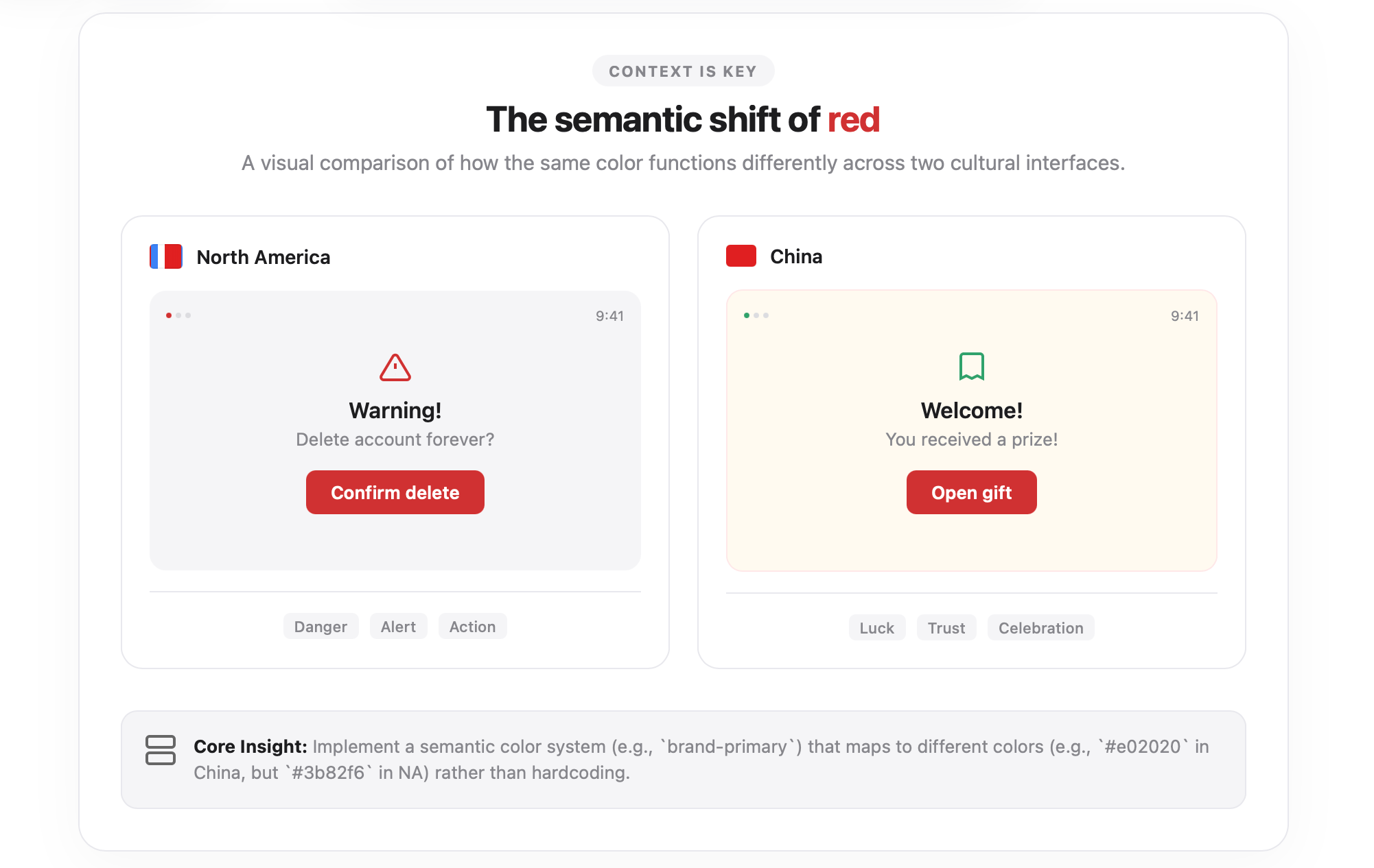
The classic example is red. In Western contexts, red on a button communicates urgency, action, or danger depending on the context. In China, red is the color of luck, prosperity, and celebration. A red CTA button is not alarming in China, but it can be trust-building. Conversely, white in Chinese cultural contexts is associated with mourning, which affects how you use white space, white backgrounds, and white typography in premium or celebratory UI moments.
Green carries almost universally positive associations (nature, go, safety), which makes it one of the safer colors to use globally in confirmations and success states. But even green has exceptions: in some Middle Eastern contexts, green carries strong religious connotations that can make commercial use feel inappropriate.
Yellow means caution in many Western interfaces. In Japan and parts of Southeast Asia, yellow is associated with courage and optimism.
The safest approach for global products is not to avoid color but to test your primary UI colors with users in target markets before launch. A rapid unmoderated test asking users to describe what a colored button or screen feels like can surface cultural mismatches quickly.
A practical pattern: define your semantic color system with culture variation in mind. Your "primary action" color should be configurable per locale at the theme level, not hardcoded everywhere. Even if you ship the same color in all markets initially, building that flexibility in early saves significant rework later.
Information density and layout expectations
Users in different markets have very different calibrated expectations for how much information belongs on a single screen.
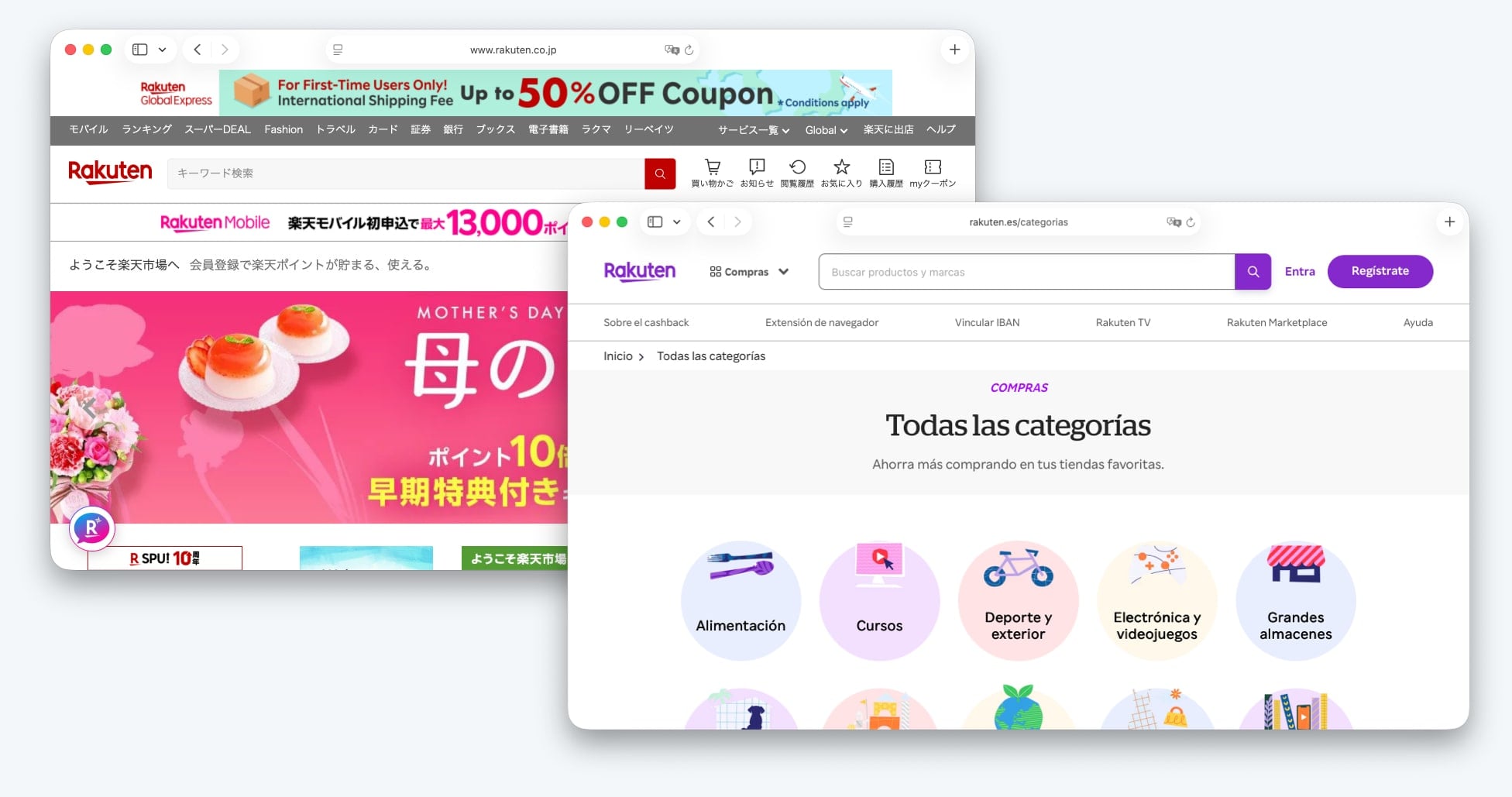
Japanese and Korean web design, historically and still today in many sectors, tends toward higher information density than what Western European and North American SaaS designers typically produce. Dense layouts with multiple navigation options, small fonts, and rich sidebars feel familiar and thorough to many Japanese users, they do not trigger the "overwhelm" reaction that the same layout might in a Scandinavian or German user.
This does not mean you should design entirely separate UIs per market. But it has real implications for decisions like:
- Whether your mobile UI should hide secondary options in a hamburger menu or surface them directly
- How much detail appears in table views vs. requiring a click to expand
- Whether your onboarding uses progressive disclosure or surfaces more context upfront
A useful middle path: design for your primary market's density expectations, then test the layout in high-density markets to see whether users feel the product withholds important information.
Amazon is a well-known example of a company that maintains a higher-density Japanese storefront than its US or UK equivalents. The adaptation is not cosmetic, it reflects observed user behavior and expectations in the Japanese market.
Reading patterns and visual hierarchy
The famous F-pattern and Z-pattern eye-tracking research on how users scan web pages was conducted primarily with Western, left-to-right readers. Reading direction affects how visual hierarchy works.
For left-to-right (LTR) languages, the natural entry point is the top-left corner. Primary navigation tends to go left, secondary actions go right. Progress indicators move left to right. Timeline visualizations flow left to right.
For right-to-left (RTL) languages like Arabic, Hebrew, and Persian, all of this reverses. The entry point shifts to the top-right. Navigation belongs on the right. Progress flows right to left. A "back" button that points left in English should point right in Arabic.
This is not just about mirroring icons. It is about the logic of your entire interface. A wizard-style onboarding flow that walks the user through steps left to right is confusing in RTL when the arrow pointing "forward" points in the direction that visually signals "back."
For teams building their first RTL implementation, the RTL design guide covers the technical side in detail, including CSS logical properties and common mistakes.
Beyond RTL, even within LTR cultures there are reading pattern differences. German users on complex B2B software interfaces tend to read more linearly and thoroughly before acting. American users are more likely to scan and take action earlier. This difference shows up in where you place calls to action and how much supporting text you include before them.
Trust signals and social proof
What makes a user trust your product varies meaningfully by culture, and getting it wrong is costly.
-
Customer logos and enterprise names as trust signals work well in North American and Western European B2B contexts. Seeing recognizable brands validates legitimacy.
-
User counts and community size ("500,000 teams use this") resonate particularly well in the United States, where scale is treated as a signal of quality.
-
Certification logos and compliance badges (ISO, SOC 2, GDPR) carry significant weight in Germany and across Western Europe, where regulatory compliance is treated as a baseline expectation rather than a bonus. German users are more likely to look for these signals before converting on a paid plan.
-
Personal testimonials work differently across markets. In cultures with higher uncertainty avoidance, where users are more risk-averse before committing, detailed case studies with specifics (company name, size, measurable outcome) tend to convert better than brief quotes. In more individualistic, action-oriented markets, a short punchy quote may be enough.
-
Pricing transparency is culturally significant. German and Dutch users particularly value clear, honest pricing with no hidden costs. Any ambiguity in pricing copy for these markets increases drop-off. This is not just a preference; it reflects a cultural value around directness and fairness in commercial relationships.
A practical pattern: audit your trust signals per locale. If your marketing homepage for Germany has the same layout as your US homepage but in German, you may be missing the compliance and transparency signals that convert German users.
Iconography and visual metaphors
Icons that feel universal often are not. A few well-documented examples:
-
The "thumbs up" icon is a positive signal in most Western markets and has spread globally through social media. But in parts of the Middle East and West Africa, it carries an offensive connotation. If your UI uses thumbs up as a "like" or "approve" action, consider whether that markets your product is targeting include regions where this applies.
-
The "hand waving" or "high five" icon used in empty states or success screens is increasingly common in SaaS products. It reads as friendly in North American and Western European contexts. In some South Asian cultures, pointing with a single finger or gesturing with an open hand carries different cultural weight.
-
Owls are used in education products (Duolingo being the most famous example) to represent learning. In parts of East Asia and Latin America, owls are associated with bad luck rather than wisdom. This does not mean you should never use an owl in a product, but it is worth knowing when you enter those markets.
-
Checkmarks vs. circles to represent completion or selection vary by UI convention across mobile platforms and markets. Japanese users in particular are familiar with circles (maru) indicating correctness, where Western conventions use checkmarks. If your product serves Japanese users on web or mobile, using a circle for "correct" and an X for "incorrect" (rather than a checkmark and a cross) maps to familiar conventions.
The practical approach is to build a small cultural review into your localization QA process for any market where you are making a significant investment. A native user reviewing your UI specifically for iconography and visual metaphors will catch issues that translation reviewers miss, because translation reviewers focus on language.
Date, time, and number formats
This is the most technical of the culture-aware UX patterns, but it is also one of the most visible when wrong.
Date formats are the classic example:
- US: 03/15/2026 (month first)
- Germany: 15.03.2026 (day first, period separator)
- ISO 8601: 2026-03-15 (year first, used in technical contexts)
- Japan: 2026年3月15日 (year-month-day with kanji units)
A user from Germany seeing a date written as 03/15/2026 either reads it as March 15 (if they are familiar with US conventions) or as the 3rd of the 15th month (which does not exist), or misreads it as the 3rd of the 15th (confusing months). None of these outcomes are acceptable for a professional product.
Number formatting follows regional conventions too:
- US: 1,000,000.50
- Germany: 1.000.000,50
- France: 1 000 000,50 (space as thousands separator)
- Switzerland: 1'000'000.50
Currency display includes position, symbol, and spacing:
- US: $1,000.00
- Germany: 1.000,00 €
- Japan: ¥1,000
These formats should never be hardcoded in UI components. The Intl.NumberFormat and Intl.DateTimeFormat APIs in JavaScript handle the formatting automatically once you pass the correct locale. The technical implementation is covered in the i18n guide; for a focused breakdown of all formatting APIs including time zones and currencies, see locale-aware formatting for dates, times, and numbers.
The UX decision is making sure your design does not assume a format. Date pickers, input masks, and form validation logic often bake in format assumptions that break for non-US locales.
Form design and personal data
How people expect to give their personal information varies by culture and by the specific information being requested.
Name field order is one of the most frequently bungled form decisions. Western forms put first name before last name. Japanese, Korean, Chinese, and Hungarian name order is last name first. A form that asks for "First name / Last name" and then uses the filled-in values in that exact order will display names incorrectly for East Asian users—or force them to fill in their names in an order that feels unnatural.
The best solution for global products is to use a single "full name" field for most contexts. If you need to parse first and last name separately for system reasons, do it on the backend with locale-aware logic, not by asking users to split their own names in a culturally foreign way.
Address formats vary dramatically. US addresses go street, city, state, zip. Japanese addresses go from largest unit to smallest: prefecture, city, district, block, building. UK addresses have a county field that does not map cleanly to US states. Latin American addresses often include additional fields for neighborhoods and urban zones.
Shipping address forms that are rigidly designed for US input formats fail international users consistently. The most practical approach is to use an address validation and formatting library that handles locale-specific requirements, rather than building custom address forms per country.
Phone number input should always use an international format selector with a country code prefix. Hardcoding a national format (ten digits, US area code structure) in a phone field excludes international users and often causes silent form validation failures.
Required fields vary by market. German users may be comfortable providing a company name for a free trial. Users in markets with privacy concerns may hesitate at the same field. This matters for your conversion rate by market.
Navigation patterns and decision-making styles
Research on cross-cultural web navigation behavior has found consistent patterns linked to Hofstede's uncertainty avoidance dimension.
Users from high uncertainty avoidance cultures (Germany, Japan, France, Greece) tend to:
- Spend more time on a page before clicking
- Look for more information before making a decision
- Expect clear navigation structures with fewer ambiguous labels
- Be more frustrated by dead ends, broken links, or unclear error messages
Users from lower uncertainty avoidance cultures (US, UK, Sweden, Denmark) tend to:
- Scan and act faster
- Tolerate more ambiguity in navigation
- Be comfortable with progressive disclosure (seeing more options after an initial click)
This translates directly into how you design onboarding flows, pricing pages, and feature discovery for different markets.
For a German B2B audience, a pricing page with detailed feature comparison tables, compliance information, and a clear FAQ section is not overengineered, it is appropriate. For a US startup audience, a shorter pricing page with a prominent free trial CTA and a single comparison table may convert better.
The practical pattern: design your primary product experience for one audience, then create locale-specific landing pages and onboarding variants for markets where user behavior differs significantly. Marketing landing pages are easier to vary by market than core product UI.
Time and urgency
Cultural attitudes toward time and urgency affect how countdown timers, "limited time offer" messaging, and deadline-driven CTAs land.
High urgency, scarcity-based copy ("Only 3 spots left!" / "Offer ends in 2 hours!") converts well in some markets and reads as pushy or untrustworthy in others. German users in particular tend to be skeptical of artificial urgency tactics. Japanese users may respond to scarcity messaging around quality and exclusivity but less so to countdown-timer pressure.
This does not mean avoiding urgency in those markets. It means framing it appropriately. A German-facing campaign emphasizing "limited beta access" around quality and thoroughness will land differently than the same campaign framed as a ticking timer.
Similarly, meeting scheduling language and calendar conventions differ. The US business week runs Monday through Friday with Sunday as the "first day" in calendar displays. In most of Europe and ISO 8601, weeks start on Monday and are numbered (Week 12, Week 13). A scheduling feature that displays a Monday (start calendar to European users) and a Sunday (start calendar to US users) is a small but meaningful localization detail.
Accessibility as a cultural and legal consideration
Accessibility standards vary by country, and in several markets they are legally enforced in ways that affect product design decisions.
The EU Web Accessibility Directive and the European Accessibility Act (EAA), which becomes enforceable across EU member states in 2025 for many product categories, imposes WCAG 2.1 AA compliance requirements. The US has Section 508 and ADA case law. The UK has its own accessibility regulations post-Brexit.
Beyond legal requirements, cultural attitudes toward disability and accommodation differ. Providing accessible equivalents for all visual content is both a compliance requirement and an expectation in markets with strong accessibility cultures.
This is relevant to culture-aware UX because accessibility features also localize. Screen reader support requires properly translated ARIA labels. Alt text for images needs localized descriptions, not just translated English copy. Color contrast requirements apply across all localized UI, not just the primary language version.
For the developer-focused technical checklist, see accessibility checklist for multilingual websites. For the broader inclusion argument, see why localizing your website is key to accessibility.
Building a culture review process
The most common way teams miss cultural UX issues is by treating localization as a translation-only review. A translator reviewing a German-language version of your product will catch linguistic errors. They will not necessarily flag that your pricing page is missing compliance trust signals, or that your onboarding wizard uses a red button for the primary CTA.
A practical culture review process adds a second layer: a native user from the target market who reviews the full product experience, not just the text, specifically looking for cultural friction. This review can be structured around a checklist:
- Formality and tone: does the product voice match market expectations?
- Color and visual design: do any colors carry unintended cultural associations?
- Icons and metaphors: are any icons potentially offensive or confusing?
- Trust signals: are the right credibility signals present for this market?
- Form design: do forms match regional conventions for names, addresses, and data?
- Urgency and pressure: does any copy feel manipulative rather than informative?
- Accessibility: are all elements accessible and correctly localized for assistive technologies?
This review does not need to be long. A two-hour session with a native user and a structured checklist will surface the majority of significant cultural friction points before launch.
Where to go from here
Culture-aware UX is a continuous practice, not a launch checklist. As you enter new markets, each one brings its own set of expectations and conventions that affect how your product is experienced.
The foundation is solid localization strategy: know which markets you are prioritizing, invest appropriately in those markets, and build review processes that go beyond linguistic accuracy to cultural fit.
Related reading:
- Localization strategy guide covers market prioritization, ROI, and workflow
- UI localization best practices for layout and component-level tips
- Language selector UX examples for navigation and discovery patterns
- RTL design guide for bidirectional layout implementation
- Localization anti-patterns for the mistakes that cost teams the most


")

