Hosted country flags
Country flags often work as intuitive language indicators within language selectors, improving overall user experience and interface functionality. Flag handling is one of the practical UI details that comes up when implementing language selectors — a topic covered in our complete technical guide to internationalization and software localization.
At SimpleLocalize, we understand the importance of seamless integration and visual consistency, which is why we offer hosted country flag icons for effortless integration into your projects.
Managing country flags in your software project
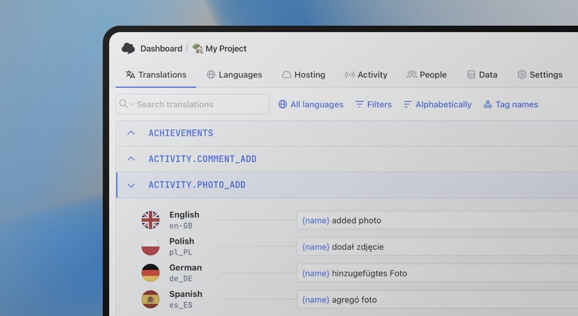
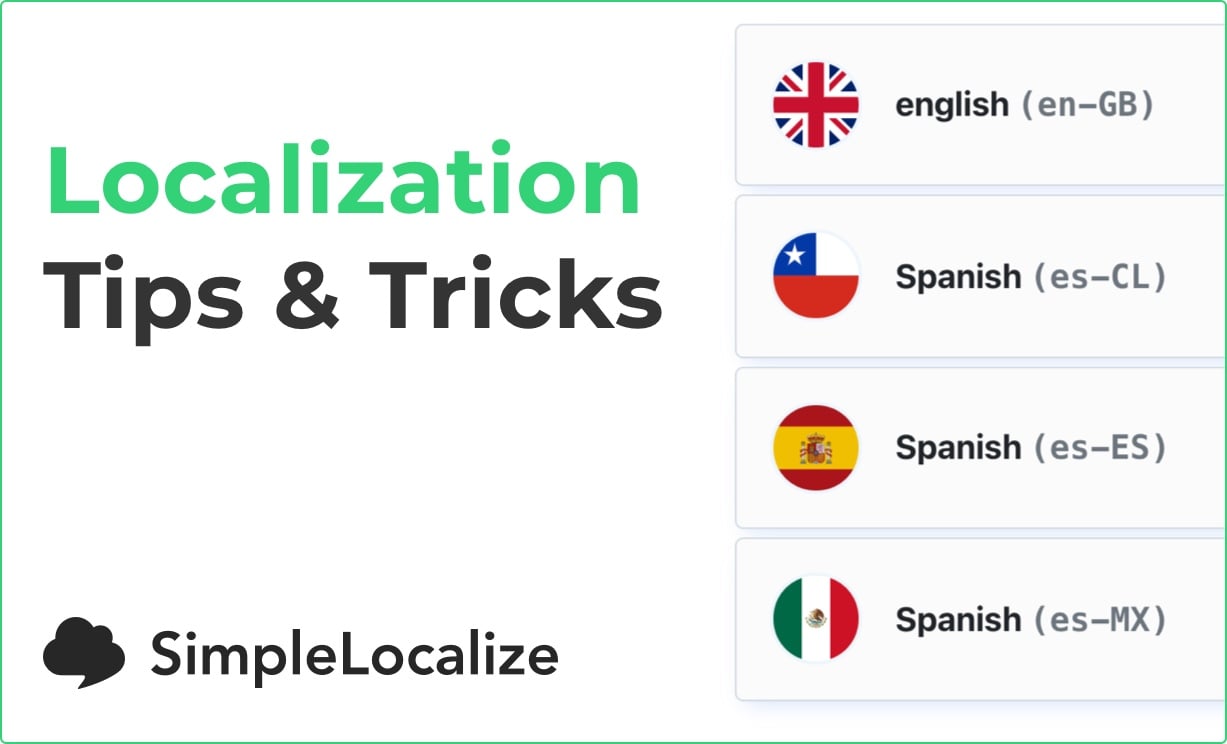
Including country flags in software projects can significantly improve the user interface's visual appeal and functionality. At SimpleLocalize, we streamline this process by using the Flag Icons project, which contains a comprehensive collection of flags in SVG format. We use it to display country flags within the SimpleLocalize user interface.
Starting today, you can seamlessly integrate these flags into your project using the following URL:
https://cdn.simplelocalize.io/public/v1/flags/{icon}.svg
Here, {icon} corresponds to the value from your hosted languages resource, which you can access via:
https://cdn.simplelocalize.io/{projectToken}/{environment}/_languages
Learn more about getting a language list for your project from Translation Hosting.
Configuring flags
To begin, head to the Languages tab in your project to configure flags.
It's important to note that flags auto-detected by SimpleLocalize won't automatically appear in the _languages section. Therefore, explicit configuration is required. Be sure to manually select the language flag in each language configuration.
Watch the video tutorial below to learn how to set up flags for your languages:
Publishing changes
Once flags are configured, make sure to publish the changes to make them readily available in your project environment.
The publish option updates the hosted translations with newly set-up language flags.
Integrating flags into your project
With flags configured and changes published, you can now seamlessly integrate them into your project using the icon field's values.
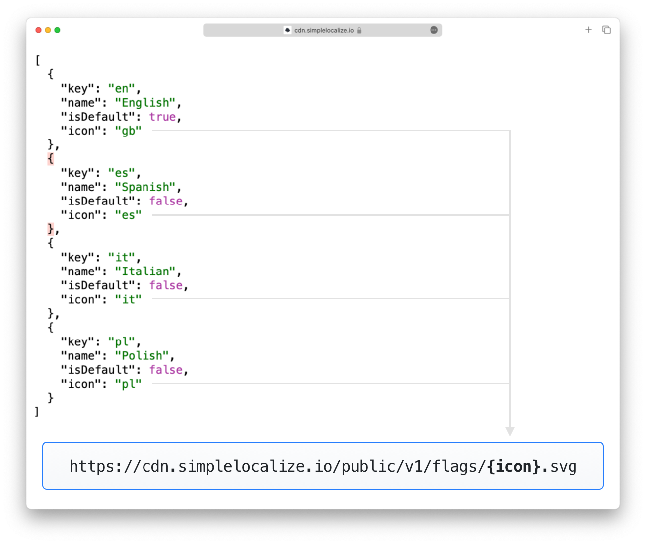
Check out sample hosted icons below.
<!-- Usage -->
<img src="https://cdn.simplelocalize.io/public/v1/flags/{icon}.svg"/>

<!-- Examples -->
<img src="https://cdn.simplelocalize.io/public/v1/flags/gb.svg">
<img src="https://cdn.simplelocalize.io/public/v1/flags/es.svg">
<img src="https://cdn.simplelocalize.io/public/v1/flags/it.svg">
<img src="https://cdn.simplelocalize.io/public/v1/flags/pl.svg">
How to make flags look good on every background?
While colorful flags look good by adding vibrancy to your UI, always make sure they remain visually appealing across various backgrounds. For example, flags with light colors may appear washed out on white backgrounds, while darker flags may blend into darker backgrounds.
To address this, consider using the box-shadow property with the inset option, to make the flag look good on every background:
.my-flag-icon {
  border-radius: 100%;
  border: none;
  margin: 2px;
  box-shadow: inset 0 0 0 2px rgba(0, 0, 0, .08);
}
This adjustment won't make the flag colors look different on the edges, but it will enhance its visibility on diverse backgrounds.
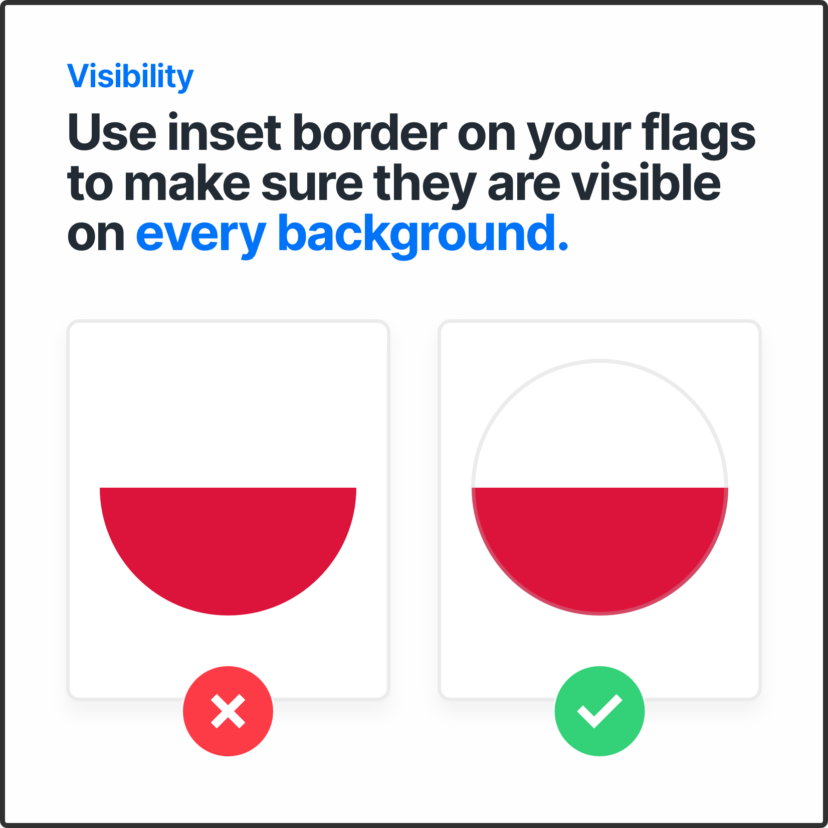
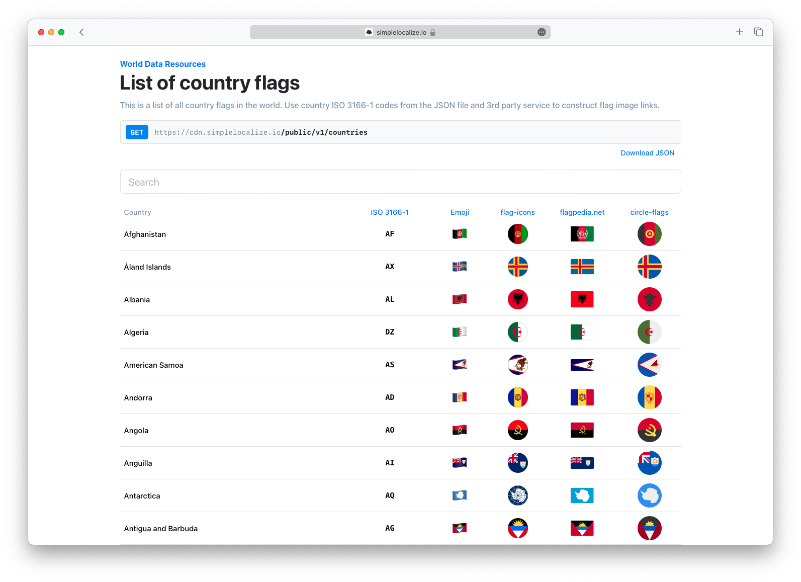
For further exploration, have a look at our blog post on alternative flag projects, and you should definitely check out our World Data Resources for comprehensive flag, country, and language-related data to best suit your project requirements.
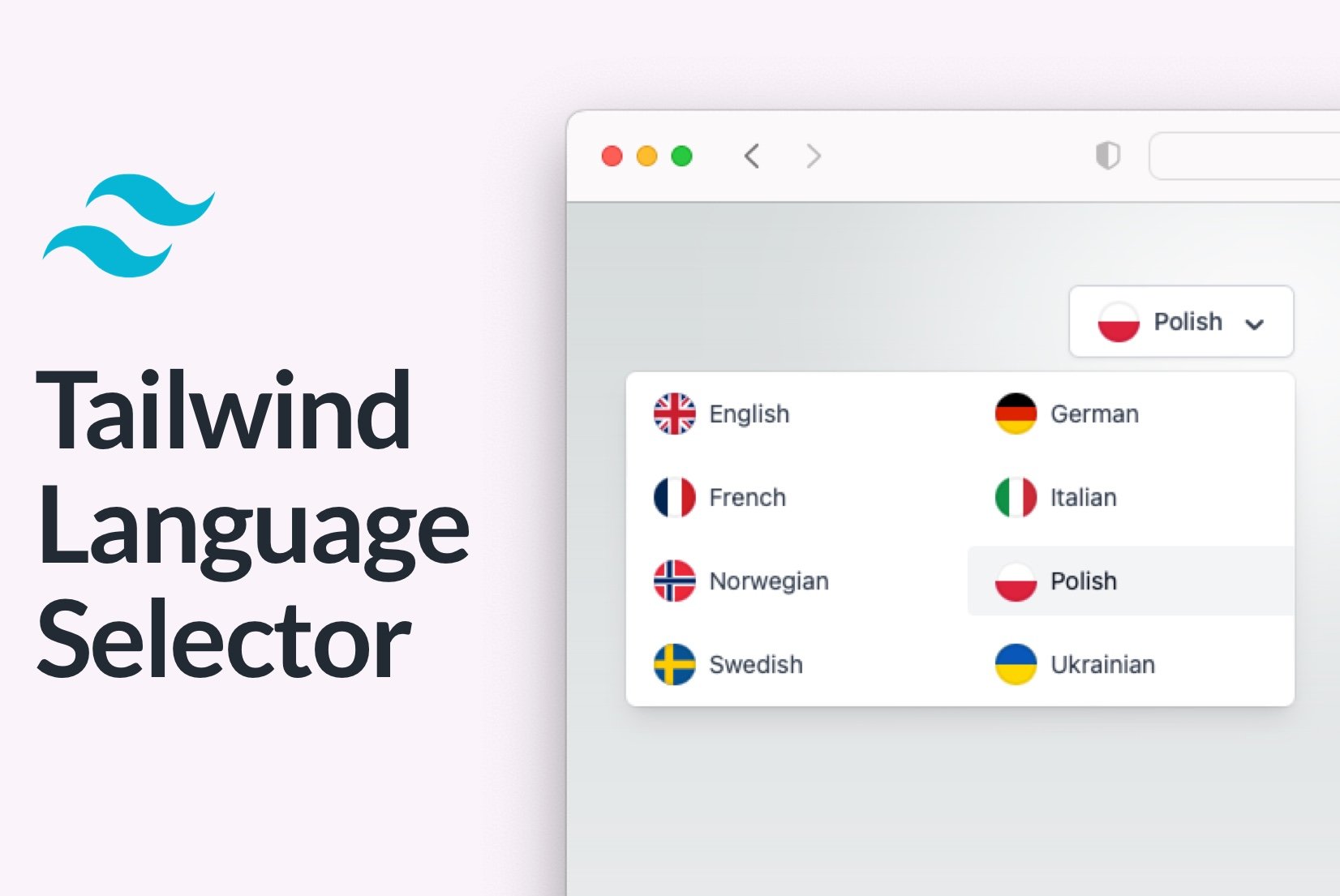
If you are building your custom language selector, then you can check out our blog post about language selectors inspirations, where we gathered the best examples of language selectors from the web.
