Flags in language selectors: Why they may hurt UX in 2025
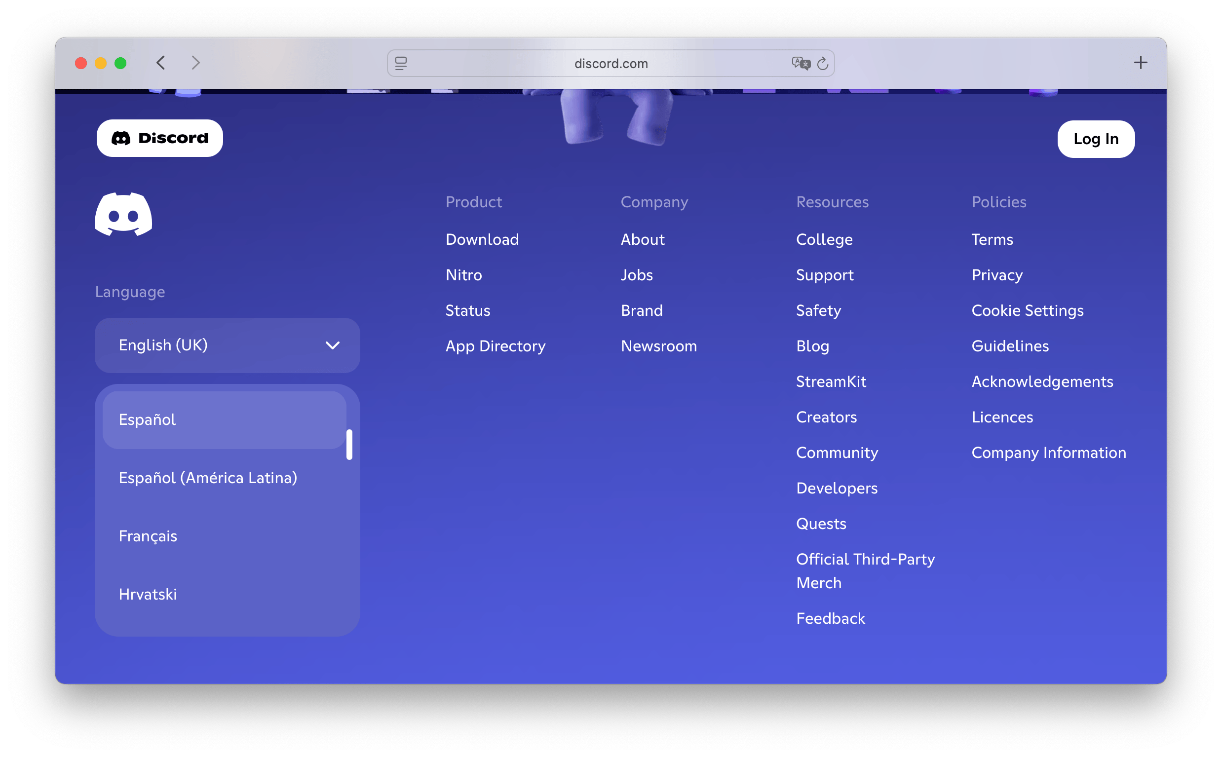
It is becoming increasingly rare to see flags in language lists on many websites. Instead, we see a written list of languages, either in their original writing or in English. Flags seem to be disappearing from website UIs. Language selector design is one of the UI localization decisions covered in our complete technical guide to internationalization and software localization. Have you added flags to the language selector in your application?
For a deeper dive into how language selectors can impact user experience and how to design them effectively, check out our dedicated post on language selector UX.
Language selectors and language representation issue
With the increasing globalization of the internet, language selectors are becoming an essential tool to make sure that a website is accessible to all audiences. They allow users to select a language they’re comfortable with, improving accessibility and enhancing the user experience. But choosing the right language selector and deciding where to put it on a website isn't as easy as it sounds.
Language selectors are often represented by flags, which can be problematic. Flags represent a country and not necessarily the language spoken in that country. This can lead to confusion and misunderstanding when it comes to representing different languages.
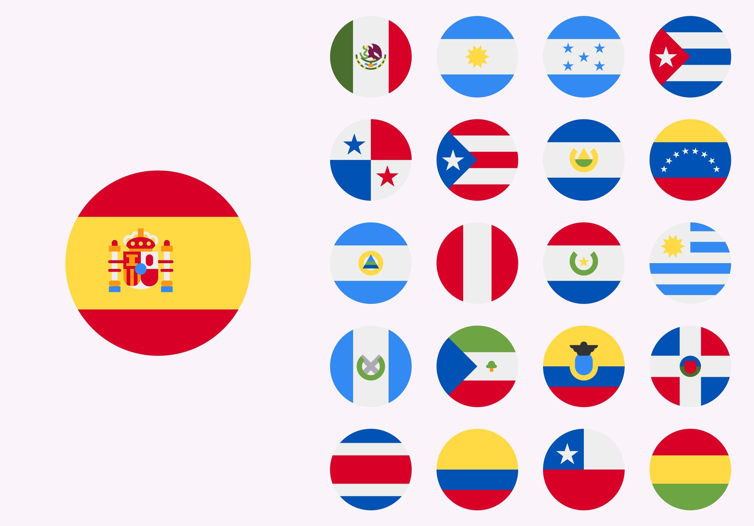
For example, Spanish is spoken in many countries, but the Spanish flag represents only Spain. The language is used in Chile, Argentina, Mexico and many other countries. Why should the Spanish flag represent Mexicans, Chileans, or other Spanish speakers who don't identify with Spain? Similarly, French is spoken in multiple countries, but the French flag only represents France. How do Canadians and Belgians feel about their language represented by the French flag?
Flags don't accurately represent languages and can lead to miscommunication between people from different countries who speak the same language. However, they are still in use and have many votes in favor, as they simplify the language selection and simply look nice. But, is this enough of an excuse? Let's go deeper and analyze the pros and cons of using flags to represent languages.
Pros of using flags in language selectors
Flags have long been used as a way of representing cultures and languages around the world. While flags can be a powerful symbol of identity and pride, they can also be controversial due to their potential to cause political divisions.
Here are some of the pros of using flags as language representation in language selectors:
Below you can read more about each of these pros.
Pros: Flags are easy to understand
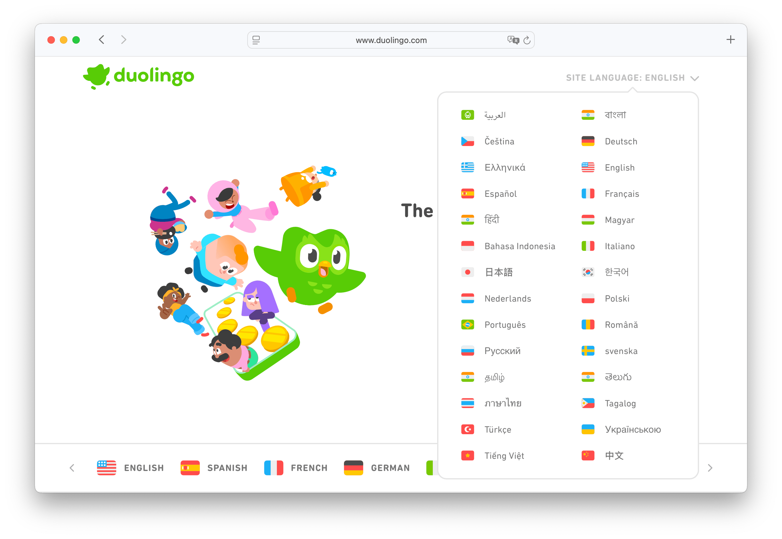
Flags are a powerful and universal, iconic language representation. They represent nations, countries, states, cultures, and ideologies in an easy-to-understand way. Their simplicity makes them easy to remember and recognize, which makes them an effective way to represent language in any format. When entering a website with the United Kingdom, Spain and German flags, users instantly know what languages the website supports.
Pros: Flags are seen instantly
Without flags as indicators, it can be more difficult to find the language selector. The flag icons are immediately associated with the option to select languages, so when the users see the flag, they immediately know where they can change the language on the site. Flag icons are more visual than the language name or code in written form.
Pros: Flags save space
Flags offer a compact, efficient way to represent multiple languages, especially on websites or software interfaces where space is limited. A little round or rectangular icon will tell the user which language they are choosing and show all the languages available.
Cons of using flags in language selectors
While flags can be a powerful symbol of identity and pride, they can also be controversial due to their potential to cause political divisions. Here are some of the cons of using flags as language representation in language selectors:
- Flags can cause misrepresentation
- Flag icons are limited
- Using a flag as a representation of a language can be seen as cultural insensitivity
- Flags add to the language inclusion problem
- Flags unite but also divide people
Cons: Flags can cause misrepresentation
Flags are ubiquitous symbols of national pride, but when it comes to representing languages, they can be severely misleading. While many countries share the same flag, each may have a diverse collection of languages spoken within its borders. This means that simply relying on flags to represent language can lead to oversimplifications and even misunderstandings of the complexities of global communication.
Cons: Flag icons are limited
Flags only represent countries, so there is no flag to represent languages that are spoken in multiple countries or regions. Furthermore, there are no flags to represent some non-official or semi-official languages, for example, Marathi (used in India), Corsican or Cherokee. Naturally, we can try using a region flag, but what about people who use that language but don't identify with a region or country, or live in entirely different locations?
Cons: Using a flag as a representation of a language can be seen as cultural insensitivity
Some flags may carry negative cultural or historical associations, so using them to represent a language can be insensitive or offensive to some users.
For example, using the Spanish flag to represent the Spanish language can be culturally insensitive because it may be seen as ignoring the other official languages spoken in Spain, such as Catalan, Basque, and Galician. These languages have their own distinct cultures and histories and are important to the people who speak them.
Furthermore, it can also be connected to Spain's historical colonization and conquest of much of Central and South America. The use of the Spanish flag to represent the Spanish language in Mexico or Argentina may be particularly sensitive due to the country's history of colonization and subjugation under Spanish rule.
Cons: Flags add to the language inclusion problem
Some languages, such as indigenous languages or dialects, may not have a recognized or official flag, so using flags may exclude certain languages or cultures.
Flags often carry political or historical connotations that may be sensitive or offensive to certain groups of people. For example, the use of the Chinese flag to represent the Mandarin language can be controversial in Taiwan, where Mandarin is also spoken but the Taiwanese flag is more appropriate.
In some countries, multiple languages may be spoken, but using a single flag to represent the entire country's language can exclude or downplay the importance of minority languages.
Cons: Flags unite but also divide people
On one hand, flags can unite people under a shared banner and create a sense of pride in their common language. On the other hand, flags can also be used to divide people and exclude those who don't fit into a particular category.
Flags as language selectors and UX
By displaying the flag of the user's language, it can enhance the user experience and make it easier for them to find content in their preferred language. On the other hand, however, they can generate negative emotions for visitors who are unfamiliar with the language or culture associated with a certain flag. The use of flags as language representation can lead to confusion and misunderstanding, which can ultimately affect the user experience.
Paradoxically, a visually cleaner and more appealing UI that uses flag icons for language selection may actually lead to poorer UX and overall worsen the experience of using the site.
Alternatives to flag icons for international sites
When it comes to designing language selectors for international sites, many designers tend to rely on flag icons to represent different languages. However, as discussed above, this approach may not always be the best choice, so it is important to consider alternative options for language selectors.
For a complete breakdown, check our language selector best practices guide.
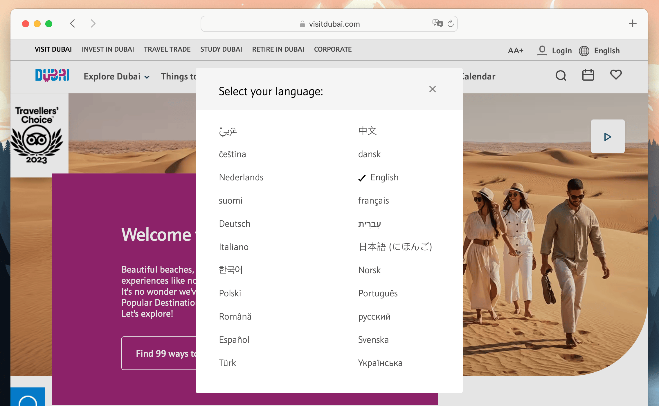
Use language names
Using language names in their native scripts or using simple text labels may be the best and the simplest option. Users should be able to easily find the language name in its native script. Additionally, to make it easier for the user, order the list of languages alphabetically.
Use neutral, universal icons
Another option for language selectors is to use culturally neutral icons or symbols that are universally recognized, such as a globe, a book, or a speech bubble. They will look nice and won't cause misunderstandings.
Use language codes instead of flags
This option clearly shows the differences between languages, without causing unnecessary friction. Use Spanish for Spain as es_ES, es_CL for Chile, es_CO for Colombia, ca for Catalan etc. Language codes are more widely recognized and understood than flags. This not only makes the language selector more accessible, but also helps to avoid any potential confusion or offense.
Use language name and country flag together
An interesting option is to use both the flag icon and the language name together. The language name represents the actual language used for translations, and the flag will work as a visual country indication for where the language is used the most.
If you're looking for lightweight, customizable icons, check out our hosted flag icons library for modern flag sets.
Apply language automatically for user's region
By applying language automatically to the user's region, you can create a seamless and personalized user experience. This not only saves time for the user, but also makes the website more accessible and user-friendly. However, note that not all users are fans of automatic localization, they might prefer to read the site content in English rather than in the language used in their region.
In this case, make sure the option to switch language is accessible and easy to find!
Make language selector accessible
This is an essential topic when creating a language selector. Make sure that the language selector is easily accessible and prominently placed on the website. This not only makes it easier for visitors to navigate the site but also shows that you value inclusivity and diversity.
By making the language selector accessible and easy to find, you can attract a wider audience and improve the user experience for all visitors. Follow WCAG accessibility standards when designing your language selector to ensure it's usable for all users.
Read more in our post on localization and accessibility.
Is it time to move away from flag representation?
The language selector is a crucial feature for websites with a global audience. However, the traditional way of displaying language options through flags may not be the most effective method.
The use of flags can often lead to confusion and misinterpretation, particularly if the flag does not match the language of the user. Moreover, flags are typically associated with countries rather than languages, which can lead to cultural insensitivity. This is especially relevant when it comes to languages that are spoken in multiple countries, such as English or Spanish.
Alternative methods may be more effective in ensuring accurate language selection. Overall, it may be time for businesses to reconsider their use of flag representation in language selectors and explore alternative options that are more user-friendly and culturally sensitive.
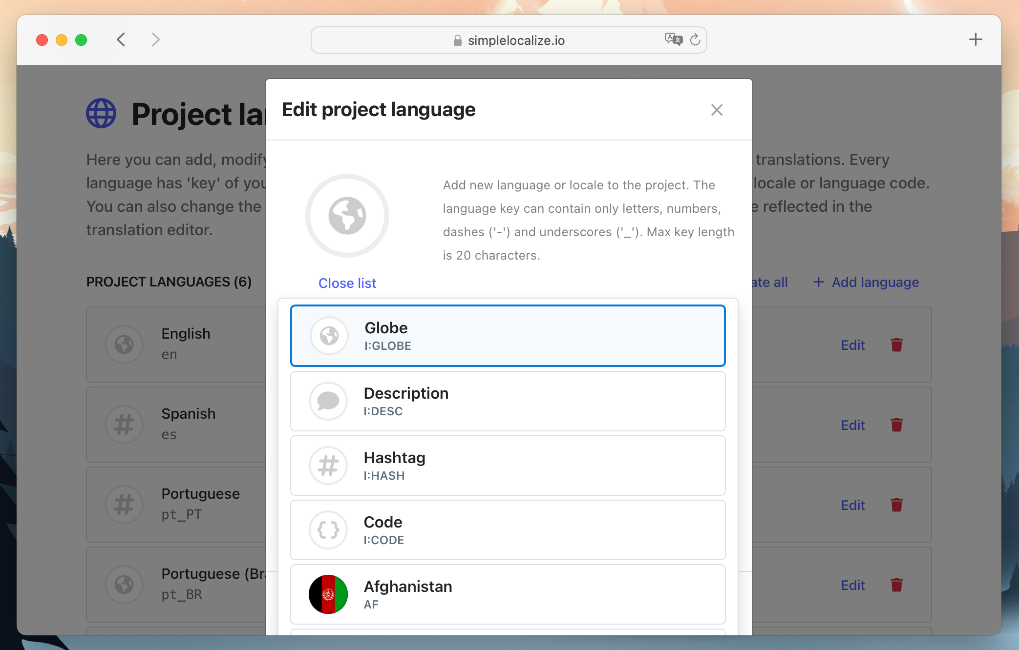
In SimpleLocalize, we gave our users an option to choose the language representation method for languages in our i18n translation editor. Languages always have their name or language code which defines the language best, but it is also possible to use flags for language representation or use a generic icon and just the language key.
Our advice: Be practical and consider how users who speak different languages will experience your site. If you offer a service for European countries and your customer base is in Europe, and your website is translated into just a few languages, it will be probably ok to use the Spanish flag for the Spanish language, and the UK flag for English. The flag can indicate that written English on this site is English as written in the United Kingdom, or Spanish is Castilian Spanish.
What is important, is that you are here because you are creating or considering creating a language selector on your website or app. Providing multilingual, localized content for your audience shows that you care about your users and customers.
Localization is the key for happy customers and growing businesses, so think about getting SimpleLocalize to help you in this process and assist you in your daily work with your software translations. Register now and use our software created for simple translation management.
Best practices for language selectors
As the web continues to evolve, so do the expectations around accessibility and design. Here are a few updated best practices for building inclusive, user-friendly language selectors:
- Avoid relying solely on flags. While visually appealing, they fail to represent languages accurately and can cause confusion.
- Make accessibility a priority. Use clear focus indicators, keyboard navigation, and ARIA roles.
- Support user preferences. Auto-detect location but always let users switch easily.
- Use native language names. Present language names in their own script, like “Français” instead of “French”.
- Combine visuals + text. For improved UX, show both language name and icon (optional flag, globe, etc.).
See our updated guides on UI localization best practices and localization & accessibility for more insights.
FAQs about flags in language selectors
Q: Is it okay to use flags in language selectors?
A: It's not recommended, as flags represent countries, not languages, and may confuse or offend users.
Q: What are the alternatives to flag icons?
A: Use native language names, language codes, or neutral icons like a globe.
Q: Are language selectors important for accessibility?
A: Absolutely. A poor language selector can make your site harder to use for international or disabled users.


