11 best language selector examples (UX + SEO guide)
A language selector is not just a UI element.
It's a strategic decision that affects usability, SEO, conversion, and global growth.
For multilingual products, the language selector is often the first interaction international users have with localization. If it's confusing, hidden, or poorly structured, users may never reach the content you worked so hard to localize.
Flags, dropdowns, auto-detection, region-first overlays — which approach works best? The answer depends on your localization strategy, URL structure, and market expansion goals.
In this guide, we analyzed real-world examples from global brands and categorized their approaches. You'll see different design patterns, understand their trade-offs, and learn how to choose the right one for your multilingual website.
Choosing the right selector is only one piece of a larger localization framework.
For a full strategic overview covering SEO, routing, and language rollout, read our Ultimate Guide to Localization Strategy.
Want to build your own selector? Read our guide on building a language selector with Tailwind CSS.
Why language selector design impacts localization strategy
A language selector may look like a small UI component, but it directly reflects how your localization system is structured underneath.
It influences:
- Your URL architecture
- Your multilingual SEO performance
- Your analytics accuracy
- Your conversion rates
- Your regional content strategy
1. It defines your URL structure
Your selector must align with your routing logic.
For example:
- If you use
/es/subdirectories, your selector should update the path. - If you use subdomains (
es.example.com), it should redirect correctly. - If you rely on server-side localization, switching should update session or cookie logic.
A poorly implemented selector can:
- Break hreflang relationships
- Create duplicate content issues
- Cause indexing problems
- Prevent users from sharing localized URLs
If you're unsure how language routing impacts SEO, read our Localization and SEO best practices.
2. It reveals whether you think in languages or locales
Many companies mistakenly design selectors around languages only:
- "Spanish"
- "English"
- "French"
But real localization often requires locale-level precision:
- Spanish (Spain)
- Spanish (Mexico)
- English (US)
- English (UK)
If your strategy includes regional variants, your selector must support them clearly.
Not sure about the difference? Language vs locale explained.
3. It impacts international conversion
Imagine this:
- A German user lands on your English page.
- The selector is hidden in the footer.
- The label says “EN” instead of “Deutsch”.
- The dropdown shows country flags instead of language names.
Friction increases instantly.
Good selectors:
- Use native language names (Deutsch, Español, العربية)
- Avoid ambiguous flags
- Are easy to find
- Remember user preference
- Update URLs consistently
Poor selectors increase bounce rates, especially in paid campaigns targeting international traffic.
4. It determines SEO scalability
If you plan to scale from 3 to 30 languages, your selector must:
- Handle long language lists
- Include search functionality
- Support grouping by region
- Stay usable on mobile
- Avoid layout overflow
The selector design you choose today affects how easily you can expand tomorrow.
Localization strategy is not static. Your UI must scale with it.
5. It shapes user trust
A visible, well-structured selector signals:
- "We serve your market."
- "You're in control."
- "This product is built for global users."
A hidden or broken selector signals the opposite.
In short:
Your language selector is not decoration. It is strategic infrastructure.
11 best language selector UX examples for multilingual websites
Here, we present a list of the most beautiful and interesting language selectors we have found, along with a brief description of each. These examples showcase various approaches to language selection, from dropdowns to flag-based selectors, and highlight the importance of user experience in multilingual applications.
Canva
Canva, the popular graphic design platform, features a language selector in the footer of its website. This discreet placement allows users to change languages without interrupting their design workflow.
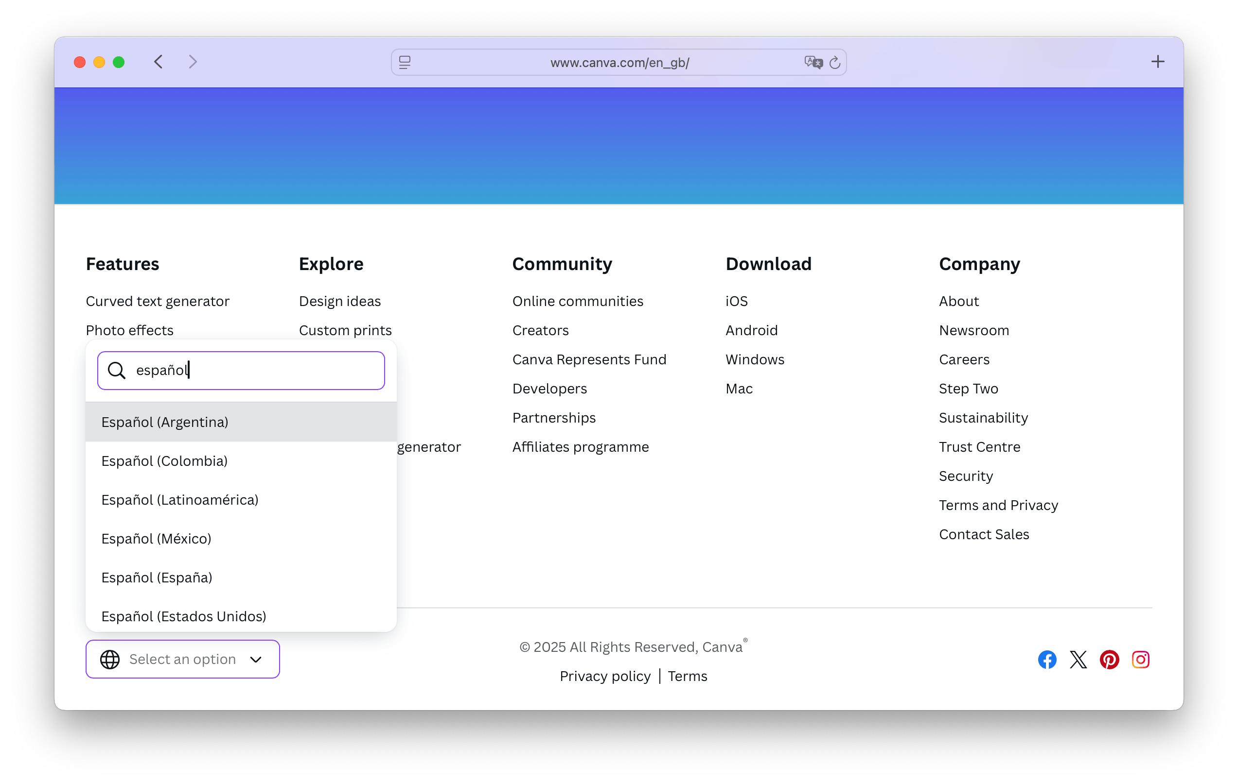
- Company: Canva
- Selector type: Dropdown
- Placement: Footer
- Uses flags: No
- URL structure:
/{locale}, e.g.,/en_gb - Special features: Search bar
What sets Canva's language selector apart is the built-in search bar, enabling users to quickly find their preferred language, especially useful with such a large list of available options.
Canva currently supports over 100 languages (104 at the time of writing), underscoring its global reach. Localization is clearly a priority for Canva, and the language selector reflects this commitment to accessibility and inclusivity.
Canva offers seven Spanish language variants — for Argentina, Colombia, Latin America, Mexico, Spain, and the United States — making it an excellent example of how to handle regional language variations in a multilingual product.
The URL structure is also localization-friendly, using clear locale codes like /en_gb or /es_mx. This approach not only simplifies language-specific linking and sharing but also aligns with SEO best practices.
Ahrefs
Ahrefs, a leading SEO tool, goes beyond simple translation by localizing content for specific regions, significantly boosting traffic and user engagement. You can learn more about their strategy in the Ahrefs blog post on localization SEO.
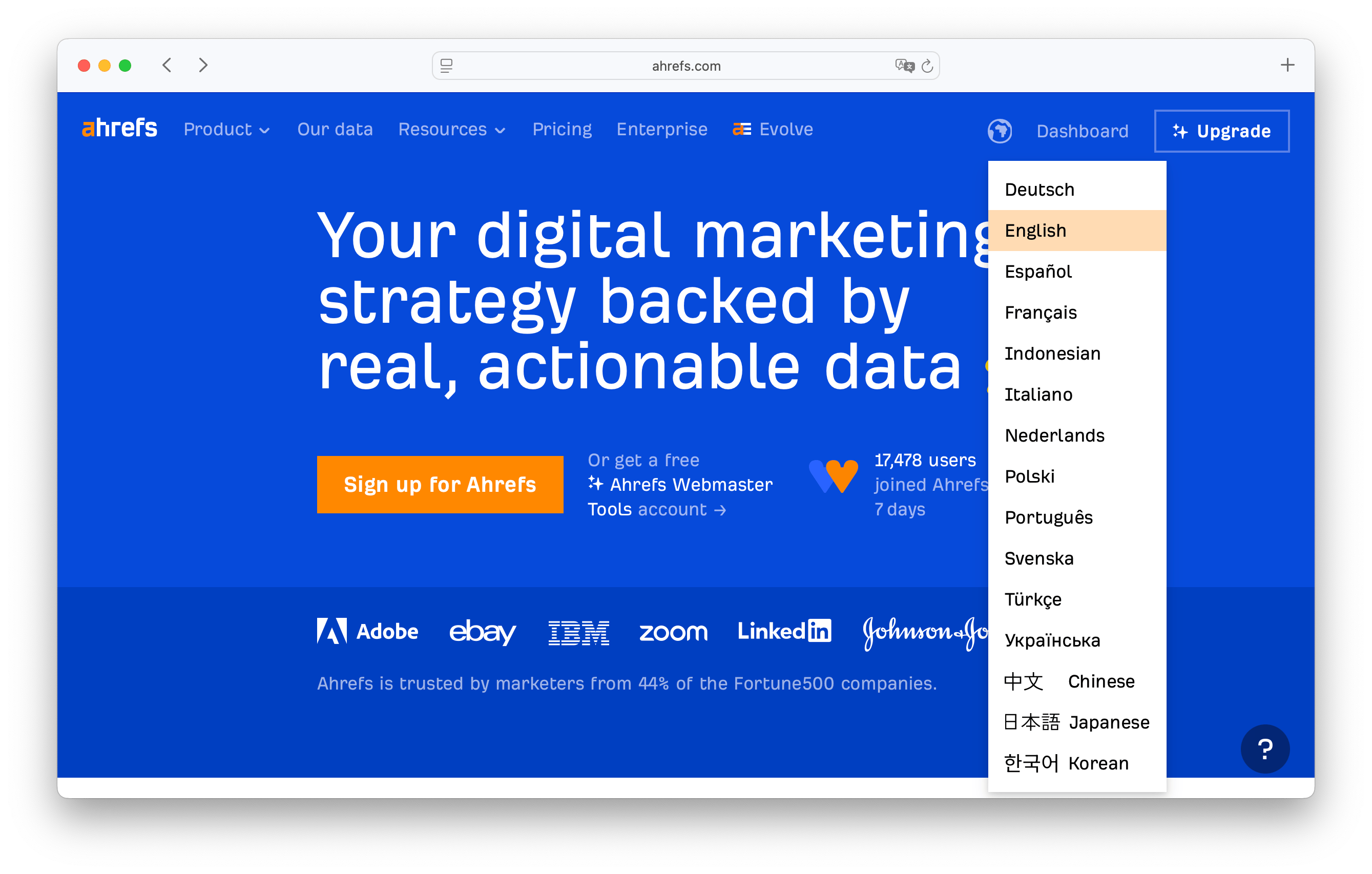
- Company: Ahrefs
- Selector type: Dropdown
- Placement: Header & Footer
- Uses flags: No
- URL structure:
/{language_code}/, e.g.,/es/,/fr/
Ahrefs features its language selector in both the header and footer, making it easy for users to switch languages no matter where they are on the site. The selector is a clean dropdown list, accompanied in the header by a globe icon — a universally recognized symbol for language selection that enhances usability.
Currently, Ahrefs offers its platform in 14 languages, including Korean, Japanese, and Indonesian. This multilingual approach reflects the company's strong focus on international growth and accessibility.
By prioritizing localized content and user experience, Ahrefs has seen notable growth in traffic from non-English-speaking markets — a compelling case for investing in localization.
Their URL structure follows a simple and user-friendly pattern, with each language version organized under a dedicated language code (e.g., /es/ for Spanish, /fr/ for French). This approach not only aids navigation and SEO but also helps users share links in their preferred language.
JetBrains
JetBrains, a well-known software development company, features a language selector in both the header and footer, ensuring that users can easily change languages at any point during their visit.
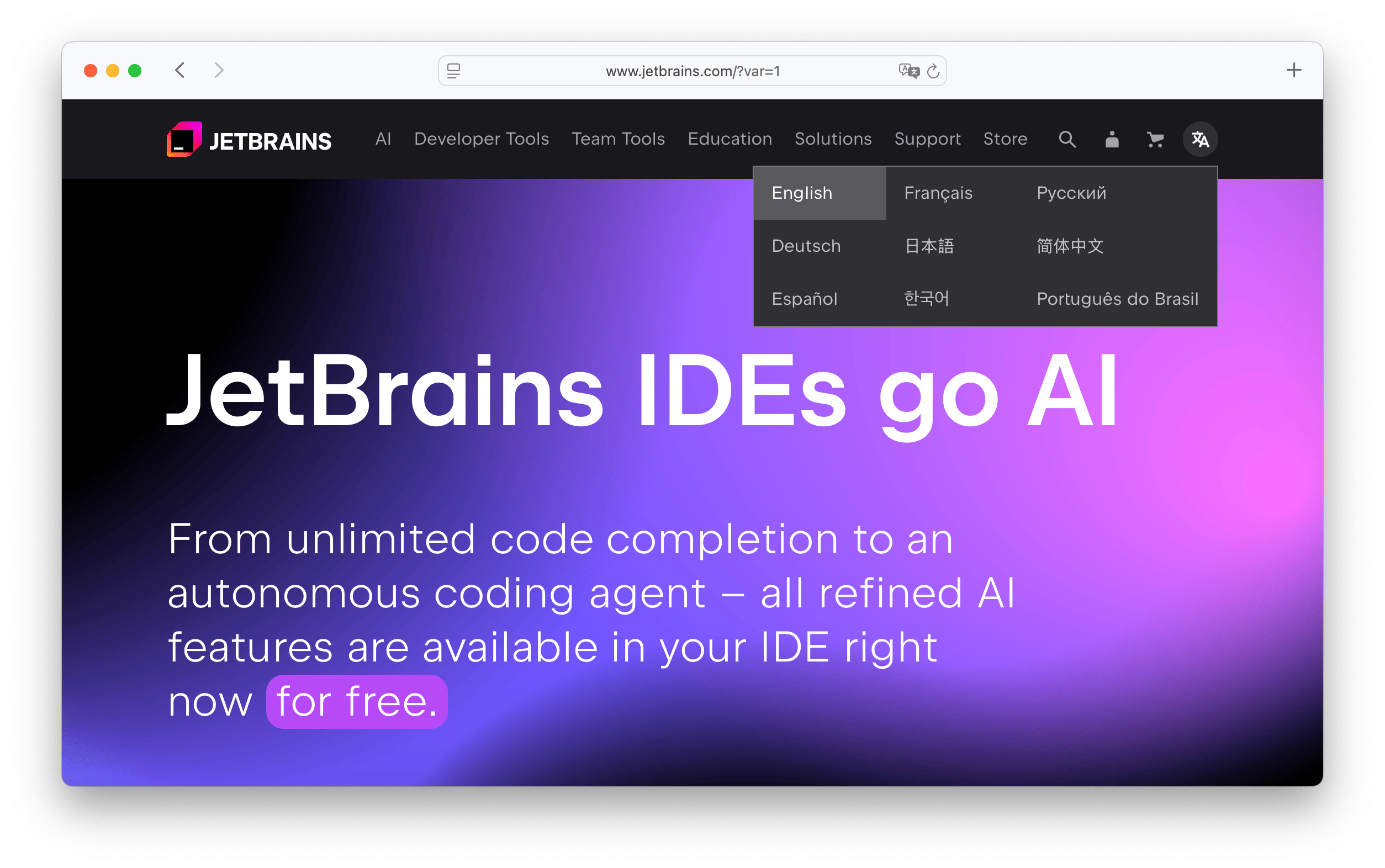
- Company: JetBrains
- Selector type: Dropdown
- Placement: Header & Footer
- Uses flags: No
- URL structure:
/{locale}, e.g.,/es-es/
JetBrains uses a wide dropdown layout for its language selector, with language options organized in columns. This structure improves readability and ease of use, especially when offering multiple languages.
The selector is marked by an icon that combines a Chinese character ("文") with a Latin letter "A" — a widely recognized symbol representing multilingual or translation options.
JetBrains currently supports 9 languages, catering to a global audience of developers and engineers. The selector's minimalistic design makes it easy for users to switch languages without visual clutter or distraction.
The inclusion of a country/region selector allows JetBrains to further tailor its content and services based on the user's geographic location.
Their URL structure follows a clear locale-based pattern (e.g., /es-es/), ensuring that language-specific content is easily accessible and shareable.
Prezi
Prezi, known for its dynamic presentation software, takes a slightly different approach to localization and language selection. Instead of a traditional dropdown or flag-based menu, Prezi features a simple language selector in the footer.
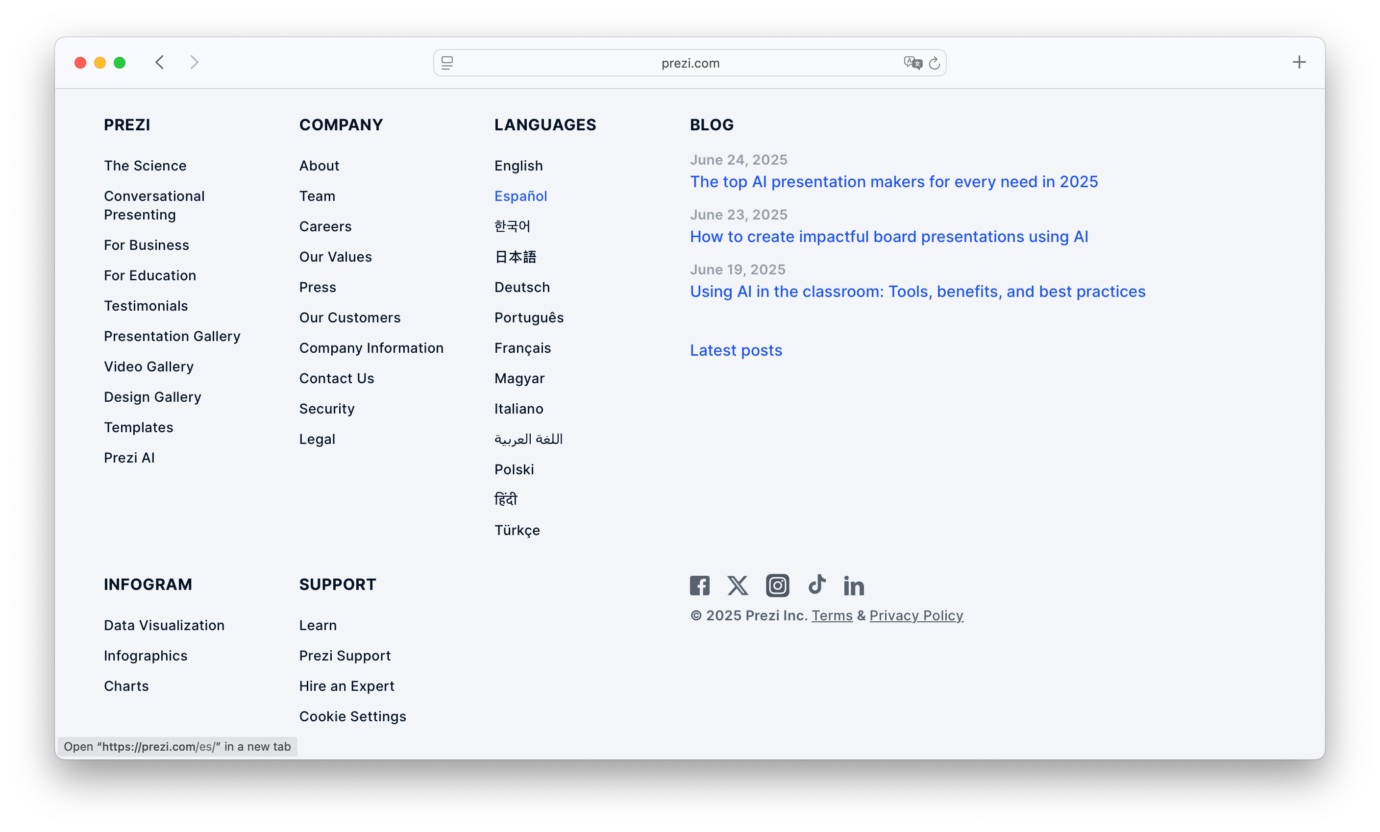
- Company: Prezi
- Selector type: List
- Placement: Footer
- Uses flags: No
- URL structure: None (uses server-side localization)
The language options are presented as a plain text list in the footer, allowing users to select their preferred language with a single click. This minimalist design is clean and unobtrusive while still providing essential functionality.
Prezi currently supports 13 languages, and its language handling differs from most websites: there is no distinct URL structure for each language version. Instead, Prezi uses server-side localization, meaning content is dynamically served based on the user's language preference.
This approach ensures a consistent URL across languages, which can be beneficial for user experience and content management, though it may have some trade-offs for SEO and link sharing.
Prezi's design reflects a focus on simplicity, removing visual noise while still offering clear access to multilingual support.
Notion
Notion is a versatile productivity workspace for teams and individuals, and it has implemented a language selector that is both functional and user-friendly.
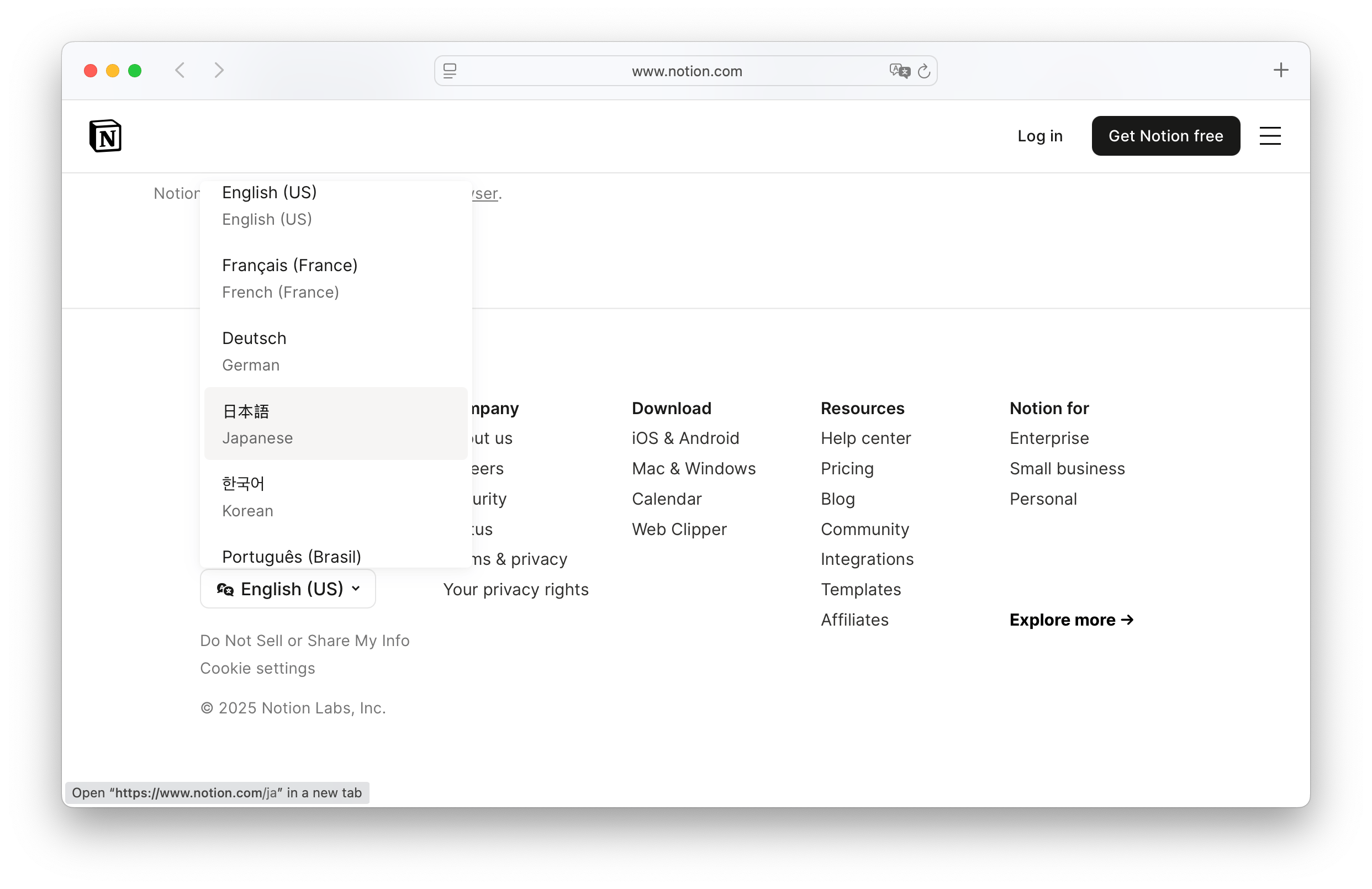
- Company: Notion
- Selector type: Dropdown
- Placement: Footer
- Uses flags: No
- URL structure:
/{language_code}, e.g.,/es - Special features: Dual-language labels
Notion's language selector is located in the footer of the website, making it accessible without interfering with the core user experience. It features a minimal, clean dropdown menu for selecting the preferred language.
What makes Notion's implementation stand out is its dual-language labeling. Language names are shown in both the current site language and the target language — for example, "Deutsch / Allemand" — which improves clarity and makes selection easier for multilingual users or those switching languages in unfamiliar interfaces.
Notion currently supports 10 languages, including regional variants such as Spanish (Spain) and Spanish (Latin America). This reflects Notion's continued commitment to localization and accessibility for its growing global user base.
Notion's dual-language design is a thoughtful touch that enhances usability and inclusivity, especially for users navigating in a second or third language.
The URL structure is simple and clean, using locale codes (e.g., /es) to distinguish different language versions.
Wix
Wix, one of the most popular website builders, offers a thoughtfully designed language selector to support its global audience. It allows users to easily switch between languages and explore Wix’s services in their preferred language.

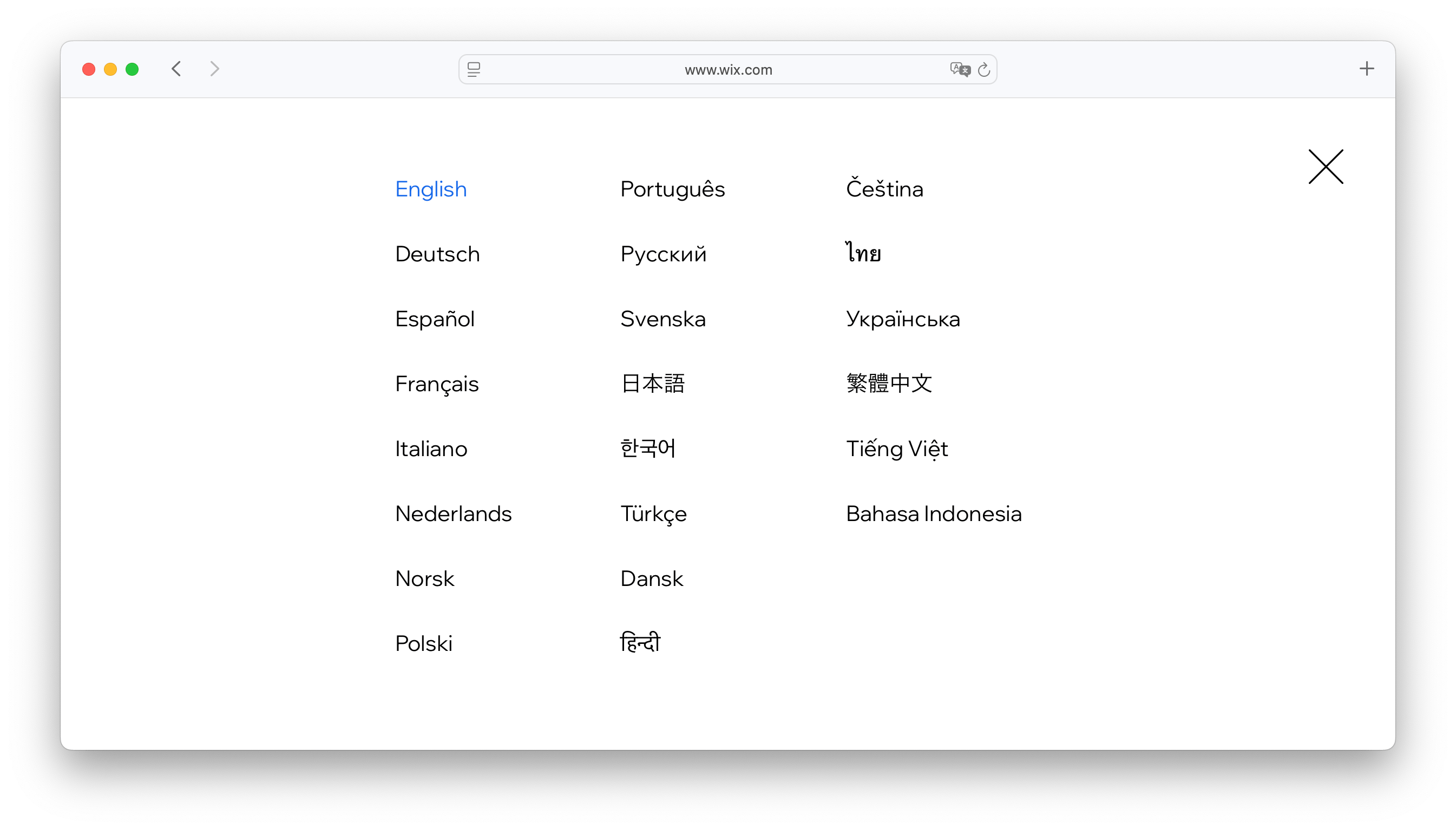
- Company: Wix
- Selector type: Overlay
- Placement: Header
- Uses flags: No
- URL structure: Subdomain, e.g.,
es.wix.com
Wix's language selector is placed in the header, indicated by a globe icon with language initials. When clicked, it opens a large full-screen modal that displays available languages in a clean, spacious layout. This format allows for additional context (like region or site variations) and provides a better experience when dealing with many language options.
Currently, Wix supports 22 languages and uses a subdomain-based structure for localization (e.g., es.wix.com for Spanish). This structure strengthens multilingual SEO while enabling clean, shareable, language-specific URLs.
Wix's use of a full-screen modal provides both clarity and scalability — a user-friendly solution for multilingual websites with many localization options.
Mango
Mango, a global fashion and lifestyle brand, takes a unique approach to localization by using a region selector instead of a traditional language dropdown or flag-based menu.
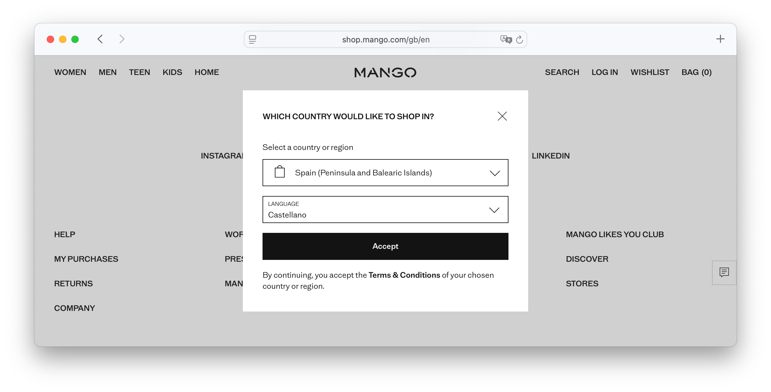
- Company: Mango
- Selector type: Region selector
- Placement: Pre-website entry
- Uses flags: No
- URL structure:
/{country}/{language_code}, e.g.,/gb/en
When users first visit the site, they are greeted with a pre-entry region selector, where they choose their country — and in some cases, their preferred language. This selection determines not only the language of the site but also the available products, prices, and shipping options, tailoring the experience to the local market.
This method ensures a seamless and localized shopping experience from the first interaction. However, it's worth noting that language is tied to the selected country, which means users can't easily switch languages independently of their region.
The site's URL structure reflects the chosen country and language in a clear and SEO-friendly format (e.g., /gb/en for English in the UK). This makes localized pages easier to share, bookmark, and index.
Mango's region-first approach is ideal for global e-commerce, prioritizing relevance and logistical accuracy over flexibility in language switching.
Duolingo
As a leading language learning platform, Duolingo places a strong emphasis on accessibility and multilingual user experience. Its language selector is designed to be both highly functional and visually intuitive.
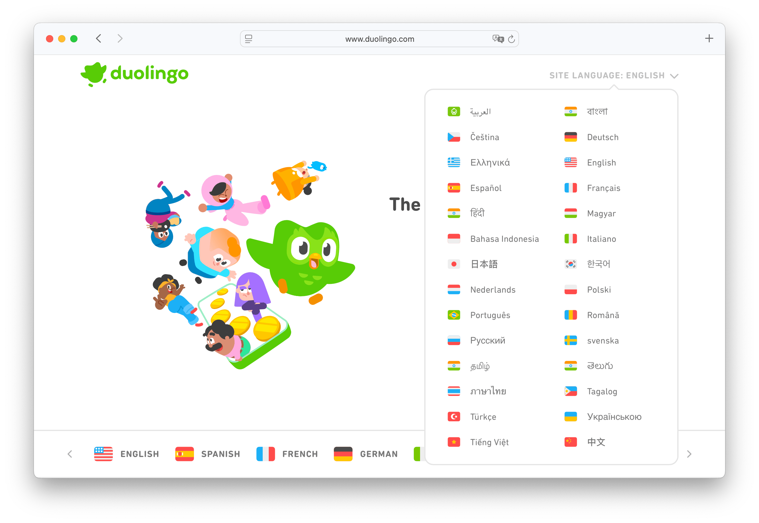
- Company: Duolingo
- Selector type: Dropdown (Header) & List (Footer)
- Placement: Header & Footer
- Uses flags: Yes
- URL structure: Subdomain, e.g.,
es.duolingo.com
Duolingo features two language selectors:
- A primary dropdown in the header, prominently labeled with "Site language” alongside the currently selected language.
- A comprehensive list of languages in the footer, offering a quick-access overview for users who scroll to the bottom.
The header dropdown includes flag icons next to each language, which adds a visual cue and makes the menu more engaging — though flags may be controversial, they are commonly used in language learning platforms and serve a clear purpose here.
Duolingo displays flag icons next to each language — a visually engaging, but sometimes debated design choice. Read more about the pros and cons of using flags in language selectors.
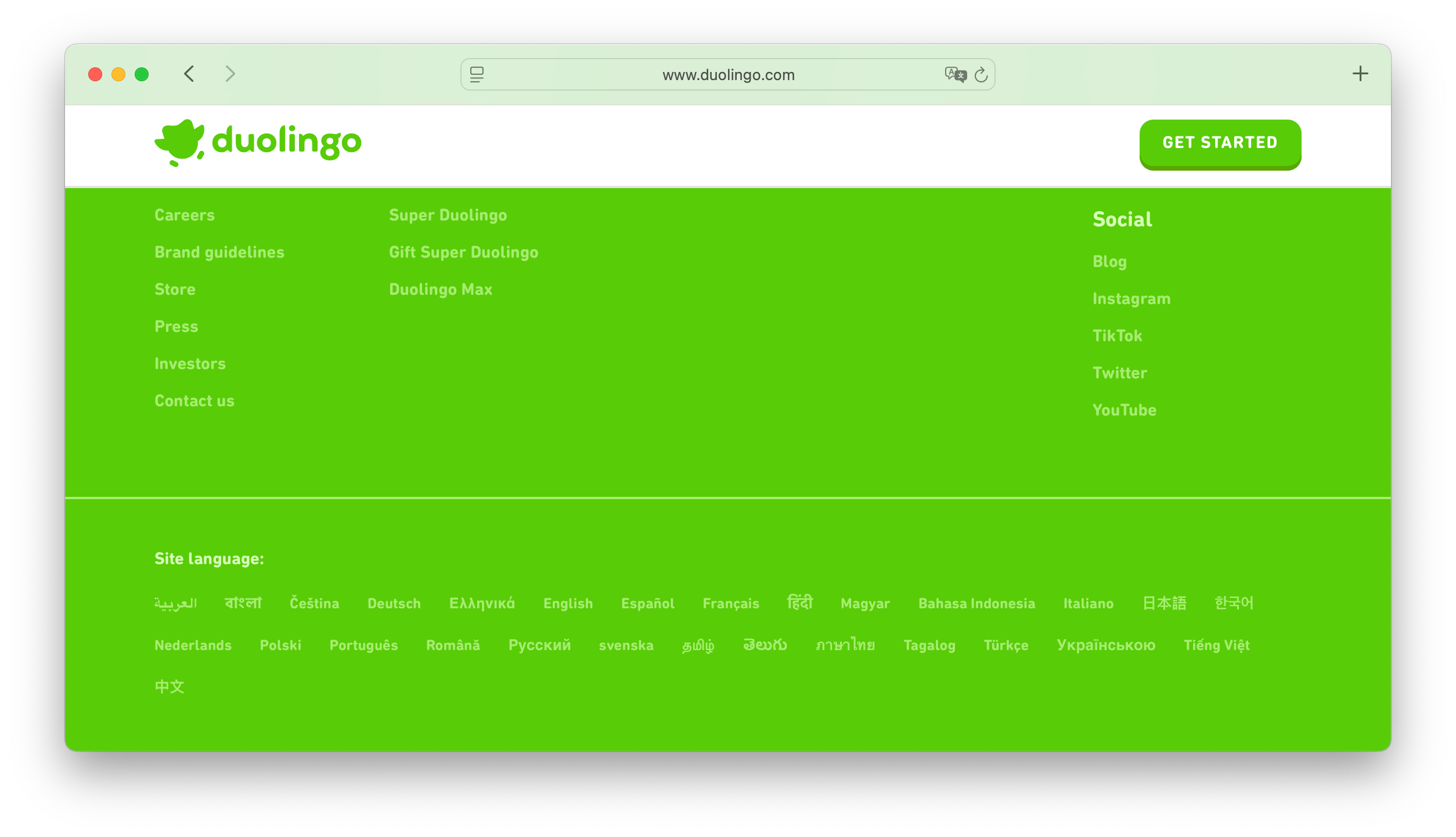
Duolingo currently supports 28 website languages, enabling users across the globe to navigate the platform in their native tongue. The site uses a subdomain structure for localization (e.g., es.duolingo.com for Spanish), which is effective for SEO and link sharing.
Duolingo's multi-placement approach — pairing a visible, user-friendly dropdown with a complete footer list — reinforces its mission of making language learning accessible and inclusive for everyone.
Discord
Discord is a popular communication platform used by gamers, creators, and communities worldwide. Its language selector reflects the platform's modern design and commitment to accessibility.
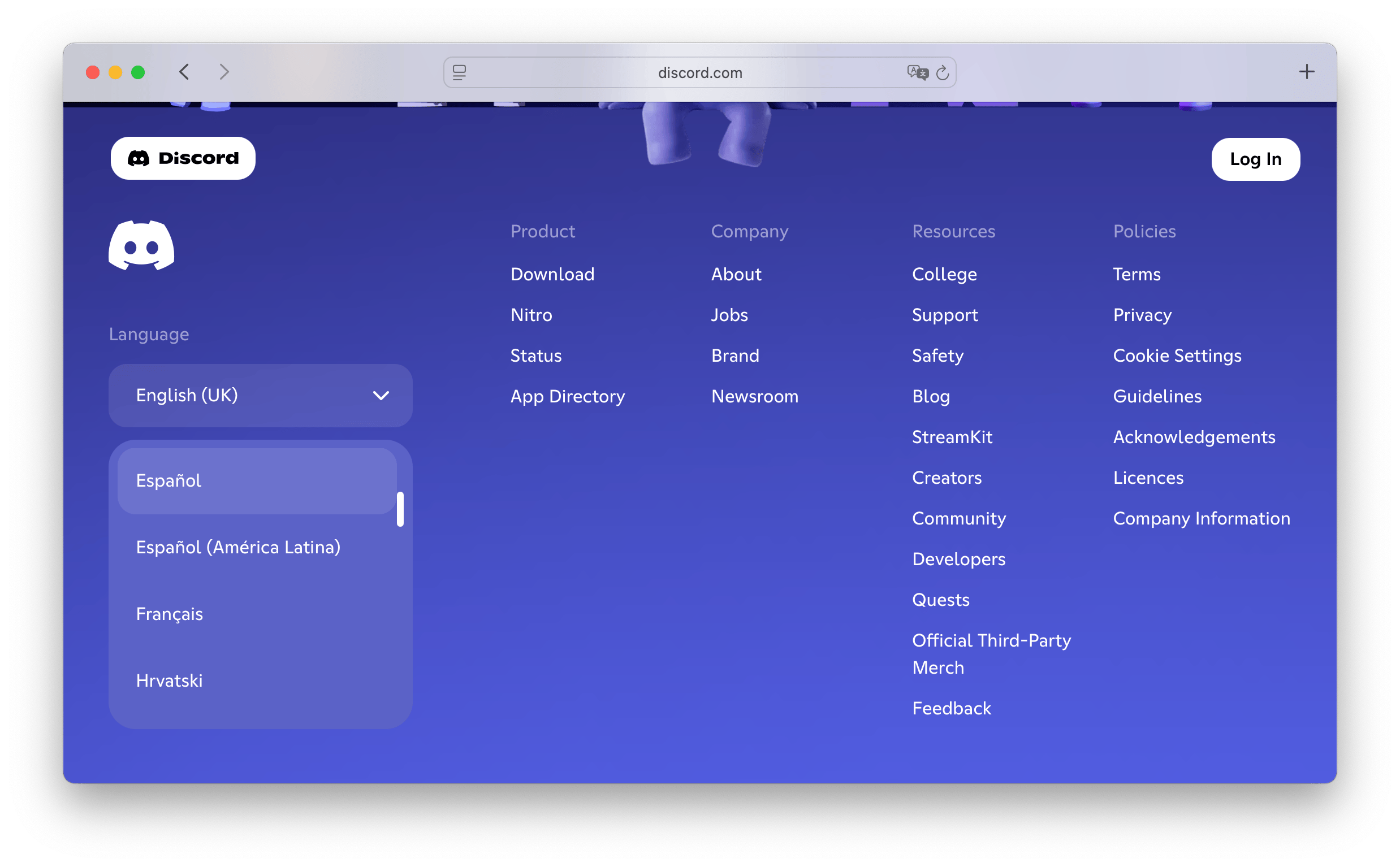
- Company: Discord
- Selector type: Dropdown
- Placement: Footer
- Uses flags: No
- URL structure: None (uses server-side localization)
The language selector is located in the footer, offering a non-intrusive way for users to switch languages. It features a clean dropdown menu that lists all available languages in plain text, maintaining a minimalist and intuitive interface.
Discord intentionally avoids using flags, opting for language names only. This decision minimizes potential confusion and ensures a more inclusive, neutral design across cultural contexts.
The platform currently supports 31 languages. Rather than using separate URLs or subdomains for different languages, Discord implements server-side localization, meaning content is dynamically rendered based on the selected language, providing a seamless and consistent experience.
Shopify
Shopify, a leading e-commerce platform, offers a thoughtfully designed language selector that enhances usability for its global audience.
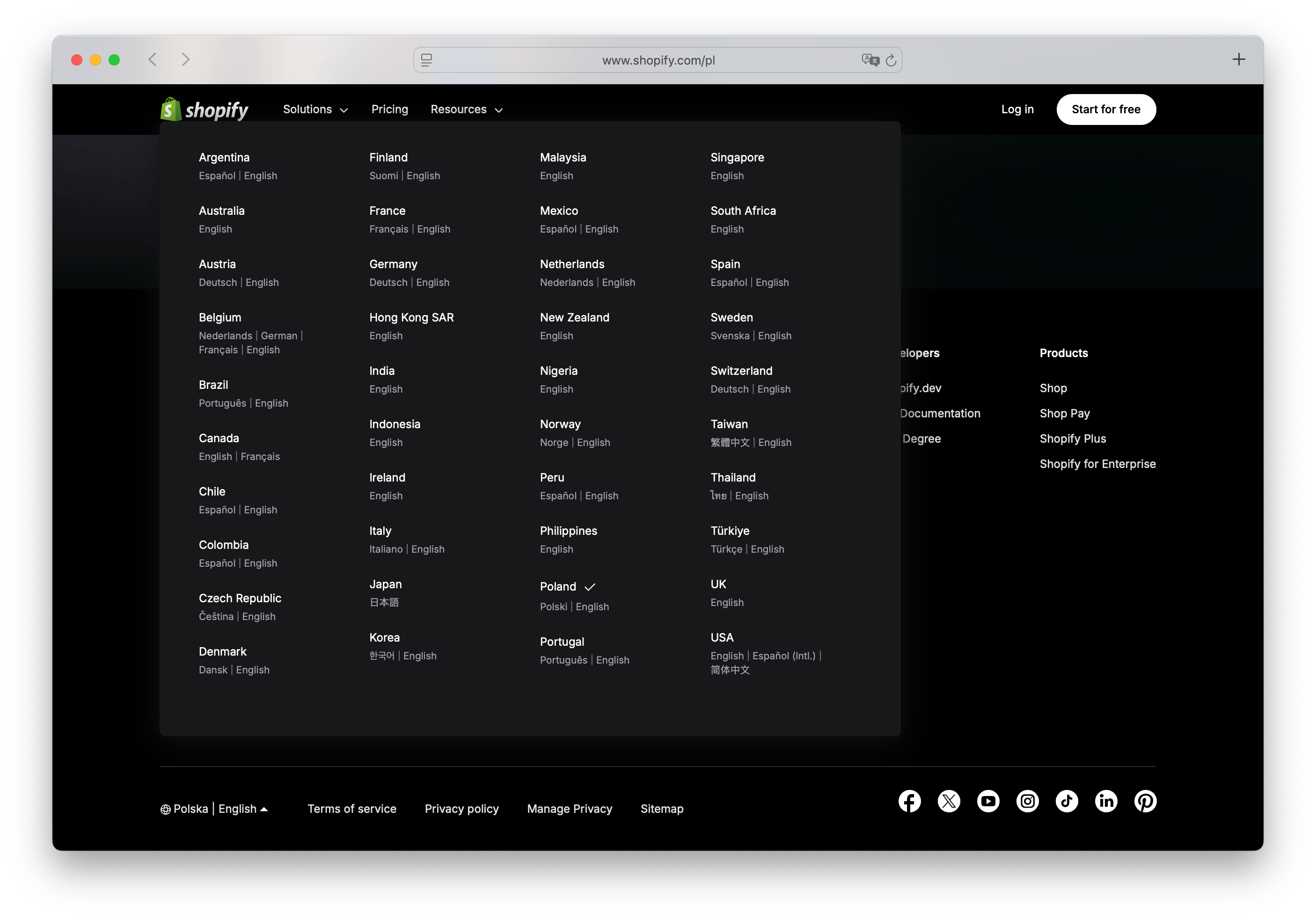
- Company: Shopify
- Selector type: Dropdown
- Placement: Footer
- Uses flags: No
- URL structure:
/{country}-{language_code}, e.g.,/es-es?country=es&lang=es - Special features: Multiple languages per country
Shopify's language selector is located in the footer, represented by a globe icon accompanied by the current country and language. When clicked, it opens a large dropdown menu that allows users to choose both their region and preferred language.
What stands out is Shopify's support for multiple languages within the same country. For example, users in Spain can select English instead of Spanish, offering greater flexibility and a more personalized experience. This is especially valuable for international users living abroad or businesses with multilingual teams.
The selector is clean and intuitive, avoiding the use of flags in favor of clear text labels. This design choice avoids potential cultural misrepresentations and keeps the interface accessible and neutral.
Shopify uses a well-structured URL format, combining country and language codes with query parameters, such as es-es?country=es&lang=es. This format supports both localization and SEO, while making it easy to share language-specific links.
If you are using Shopify for your online store, check out our guide on how to localize your Shopify store with SimpleLocalize.
GetYourGuide
GetYourGuide, a popular travel booking platform, features a language selector that is both functional and visually appealing, enhancing the user experience for its international audience.
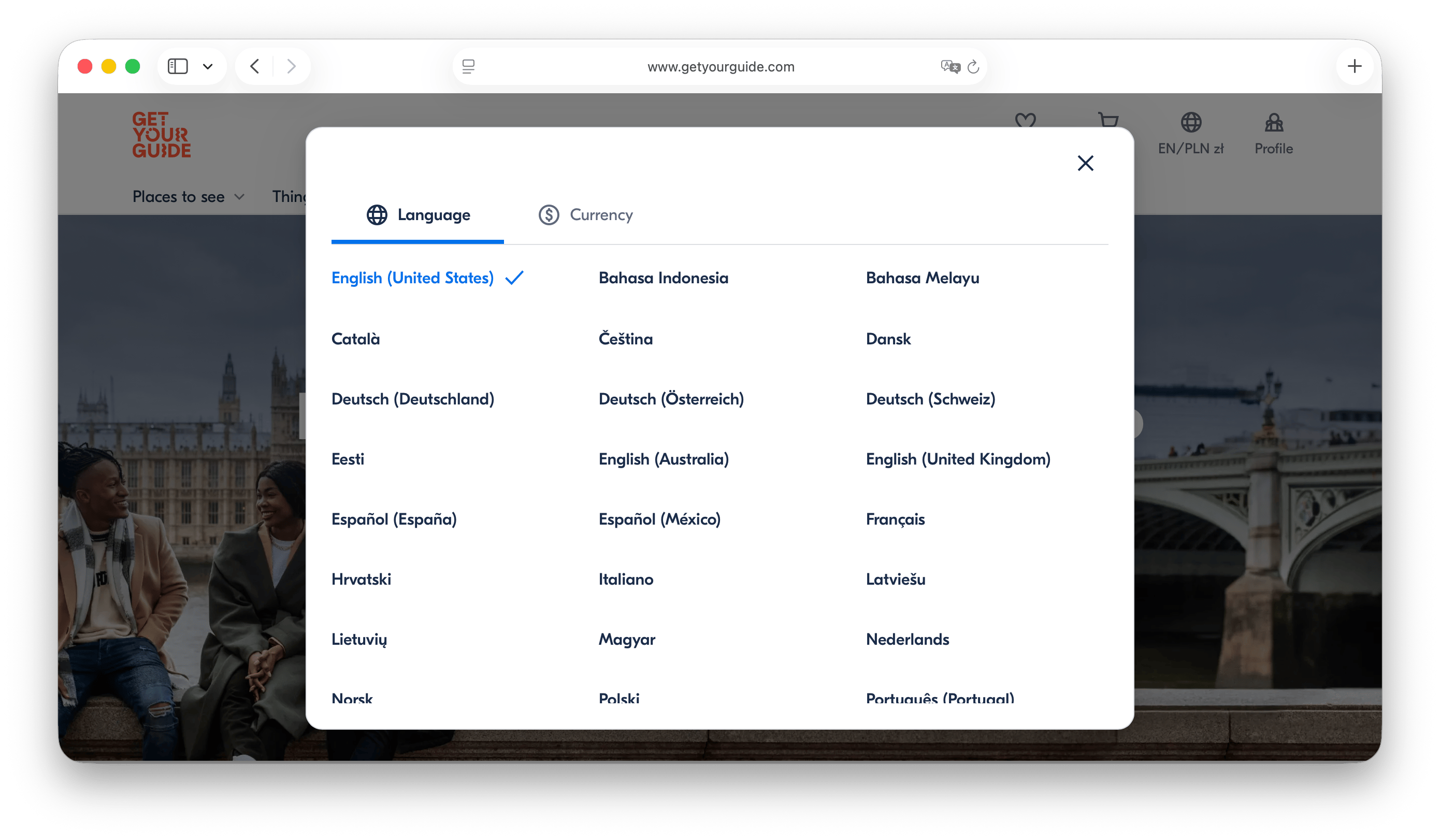
- Company: GetYourGuide
- Selector type: Dropdown
- Placement: Header & Footer
- Uses flags: No
- URL structure: domain-based, e.g.,
www.getyourguide.itfor Italian,www.getyourguide.defor German - Special features: Country-specific content, locale-based
GetYourGuide's language selector is prominently placed in both the header and footer, ensuring that users can easily switch languages regardless of where they are on the site. For a travel platform serving international users, localization is mission-critical, and GetYourGuide reflects that in its selector design.
The dropdown menu is clean and straightforward. It opens a modal that allows users to select their preferred language, which also determines the country-specific content they will see. Users can also choose the currency they want to use, which is a thoughtful addition for an e-commerce platform.
GetYourGuide currently supports 44 languages, and its URL structure is domain-based, with different country-specific domains for each language version (e.g., www.getyourguide.it for Italian, www.getyourguide.pl for Polish). This approach enhances SEO and provides a clear signal to both users and search engines about the localized content.
Languages are listed in their native names, and GetYourGuide shows language variants for some languages, such as Español (España) and Español (Mexico), allowing users to select the version that best suits their needs.
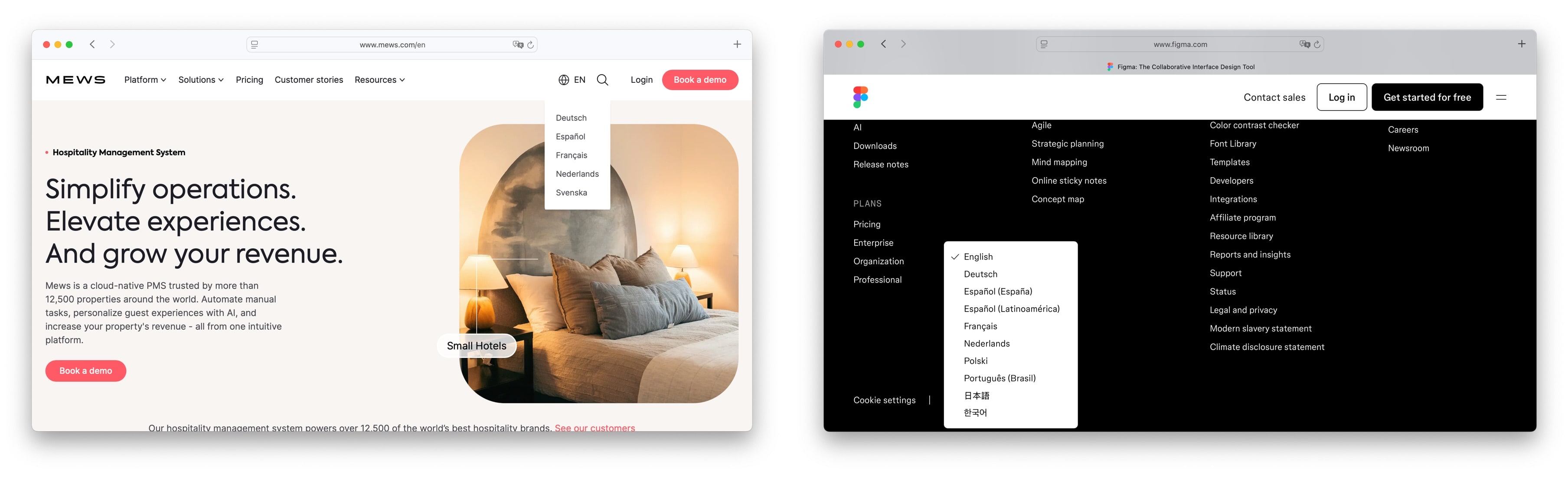
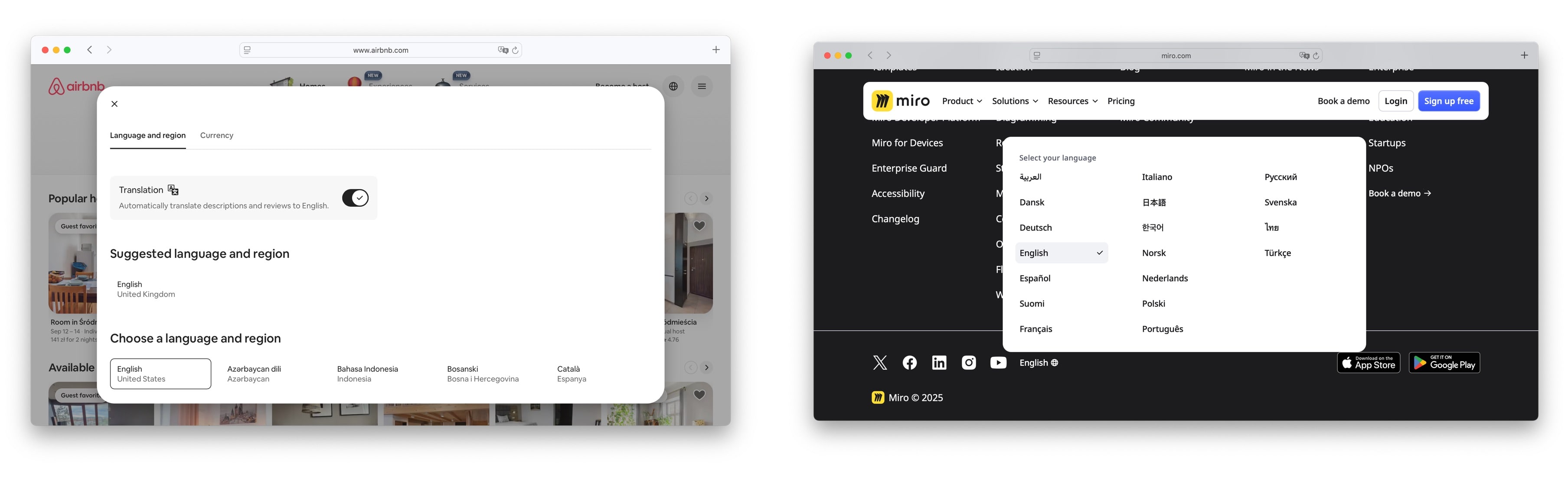
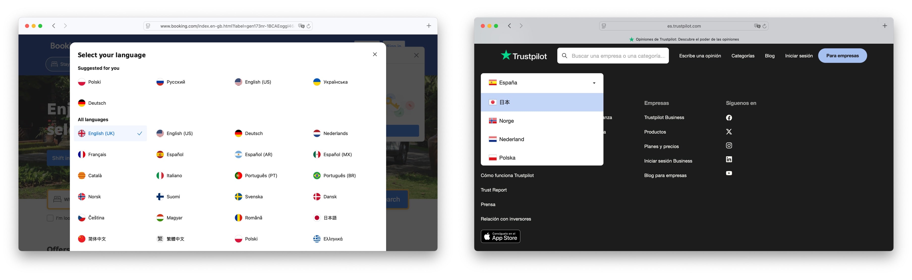
More inspirations
Check out below some additional language selector examples that showcase different design approaches and functionalities. Draw inspiration from these designs to create a language selector that fits your website's needs.
- Mews and Figma development teams have created simple and elegant language selectors that can be easily integrated into your projects.
-
Airbnb offers an option to automatically translate content that is not available in user's language, and presents the list of available languages in a dropdown menu.
-
Miro also has a simple language selector in the footer, allowing users to switch languages easily.
- Booking.com and Trustpilot have decided to use a more visual approach, displaying flags next to the language names in their selectors. This can be helpful for users who are more visually oriented.
-
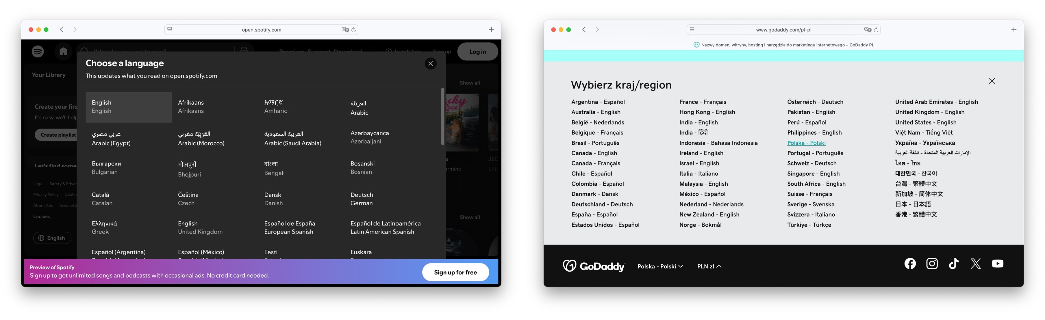
Spotify presents a language selector in the footer, displaying the language names in their native scripts and current language. It is great solution to make it easier for users to find their preferred language.
-
GoDaddy, a popular web hosting and domain registration company, has a language selector in the footer of its website. The selector is a simple list of countries with their respective languages, allowing users to easily switch between them.
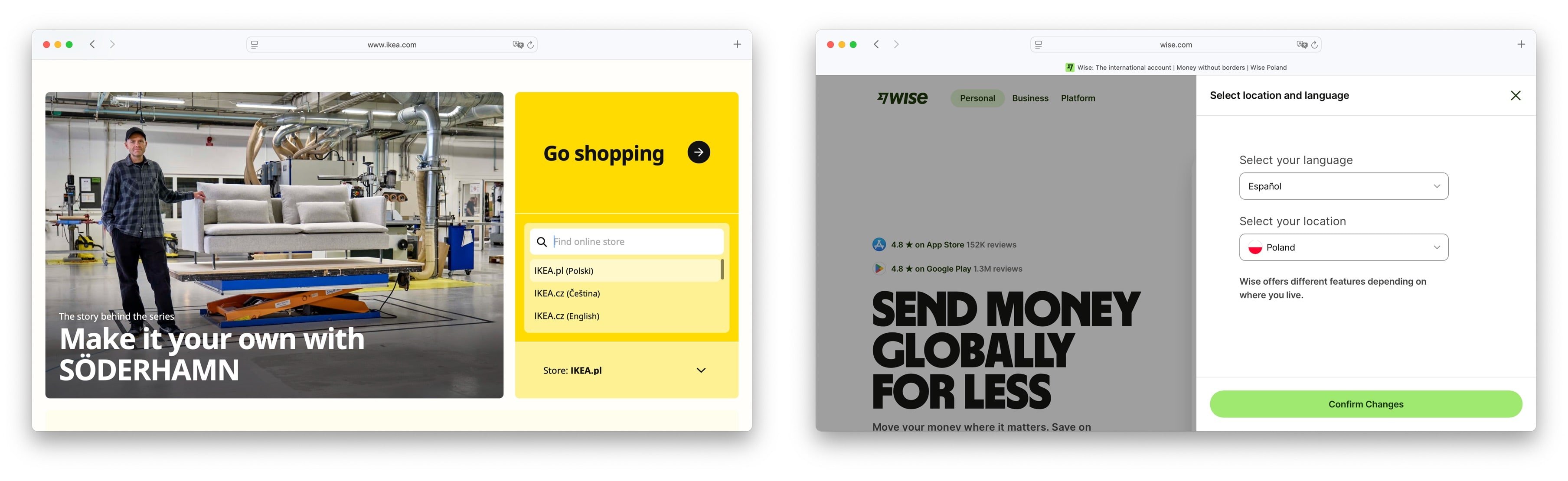
- Ikea and Wise include location selection in their language selectors to match their offerings to the user's region. This approach ensures that users see content relevant to their location, such as product availability or local services. Wise allows users to additionally selected a different language than the one spoken in their country, providing flexibility for multilingual users.
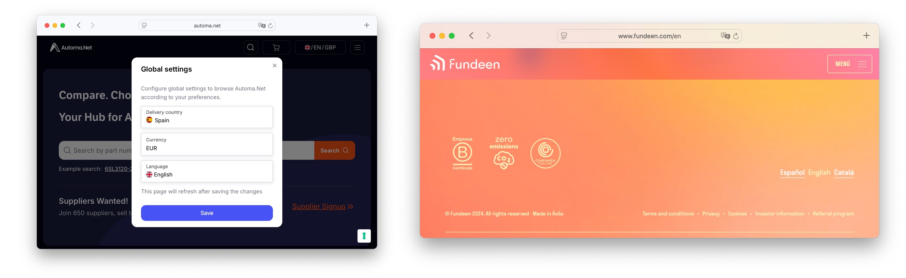
- Automa.net and Fundeen have implemented language selectors that are pulling translations from SimpleLocalize. This integration allows for easy management and updates of translations, ensuring that users always have access to the latest content in their preferred language.
Check out how they are using our translation management software to manage their multilingual content effectively:
- Automa.net case study: Automa.net case study
- Fundeen case study: Fundeen case study
If you know any other interesting language selector examples, please let us know at contact@simplelocalize.io and we will add them to the list!
8 lessons from great language selector UX
After analyzing these language selectors, we can draw several key observations and conclusions about effective design and functionality:
- Make it accessible – Keep selectors visible in headers or footers.
- Keep it minimal – Avoid visual clutter; dropdowns work well.
- Avoid flags (unless language = country) – Modern global brands increasingly use text-based selectors to avoid political or cultural ambiguity.
- Add a search bar – Helpful for platforms with many languages.
- Use dual-language labels – Improves clarity for non-native users.
- Account for regions – Regional variants (e.g., es-MX vs es-ES) matter.
- Optimize URL structure – Use /locale, subdomains, or query strings.
- Consider server-side rendering – Great for consistency, but impacts SEO.
Not sure what the difference between a language and a locale is? We've got you covered.
How to manage your website translations
The companies above don't treat language selection as decoration.
They treat it as part of their global growth infrastructure.
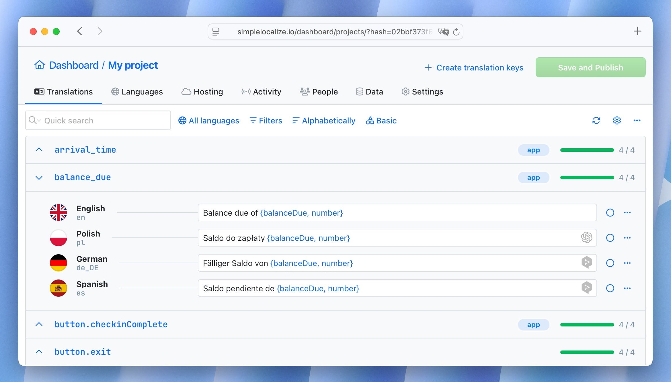
If you're looking for an easy way to manage your website translations, give SimpleLocalize a try. It's a powerful yet user-friendly translation management system (TMS) that lets you manage translations, collaborate with your team, and integrate multilingual content into your app or website effortlessly.
With SimpleLocalize, you can:
- Manage translations easily: Add, edit, and organize translations with a simple UI.
- Collaborate with translators: Invite team members or professional translators to your project.
- Integrate with your website: Use our integration guides to connect with your frontend or backend stack.
- Automate translation updates: Sync translations with your codebase using CLI or CI/CD tools.
- Host translations in the cloud: Secure, fast, and accessible translation hosting from anywhere.
- Get expert support: Our team is here to help you succeed.
Ready to create a better language selector for your site or app? Try SimpleLocalize — a powerful and developer-friendly translation management system.
Manage strings, invite translators, sync with your codebase, and deliver a seamless multilingual experience.


