How to make your website accessible
Accessibility is no longer optional—it is a core part of building digital products that work for everyone. From color contrast to keyboard navigation and localization, inclusive design ensures that users of all abilities can fully access and enjoy your content.
This guide is packed with real-world pitfalls, practical tips, and fast fixes you can apply today. Whether you are a designer, developer, or product owner, these insights will help make your website more inclusive without compromising design or performance.
Why accessibility matters
The internet should be for everyone. But millions of users still face barriers when accessing digital content because of poor contrast, non-intuitive navigation, or language barriers.
According to the WHO, over 1 billion people live with some form of disability. If your site isn't accessible, you are excluding a huge part of your audience.
Legal reasons aside (ADA, WCAG, etc.), accessible sites are:
- Easier to use on mobile
- Faster to navigate
- More SEO-friendly
- More inclusive for non-native speakers or neurodivergent users
What is accessibility?
Accessibility is clarity and communication. In web development, it means designing websites that can be used and understood by everyone, regardless of someone's physical or cognitive abilities.
This includes users with:
- Visual impairments (e.g. color blindness, low vision)
- Hearing loss
- Limited mobility or fine motor control
- Neurodivergent processing (e.g. ADHD, dyslexia)
- Reliance on screen readers or non-standard input methods
- Multilingual backgrounds or limited language proficiency
The goal of accessibility is to create a digital experience that communicates clearly, no matter how someone reads, listens, moves, or understands. When your website is accessible, you are not just meeting guidelines. You are opening the door for more people to participate fully in what you have built.
Need to support users across multiple languages? See what is software localization and how it works to learn how localization can help you reach a global audience.
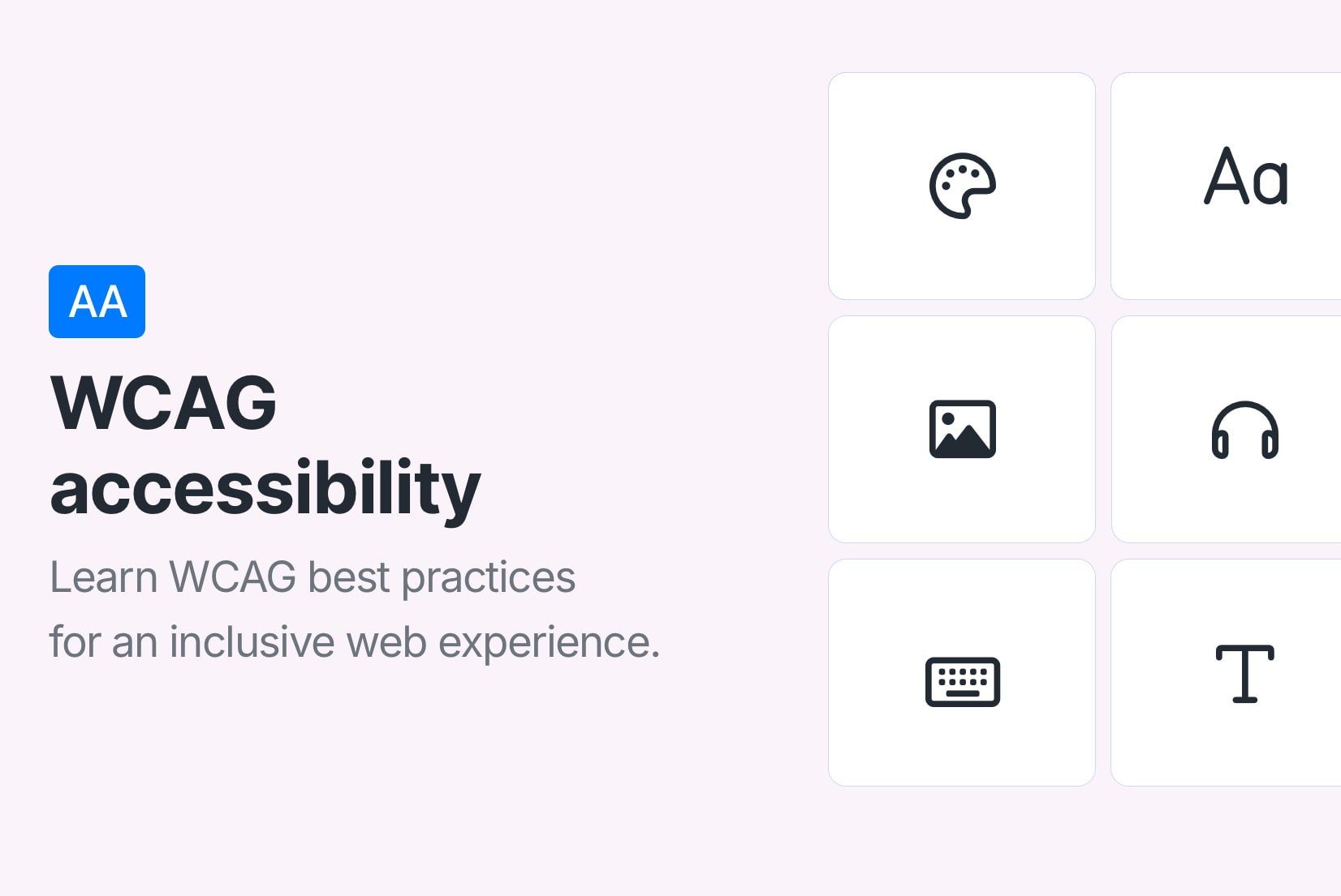
Key accessibility factors
To make your website accessible, you need to consider several key factors that affect how users interact with your content. Here is a breakdown of the most important accessibility factors, along with actionable advice and technical examples you can apply right away.
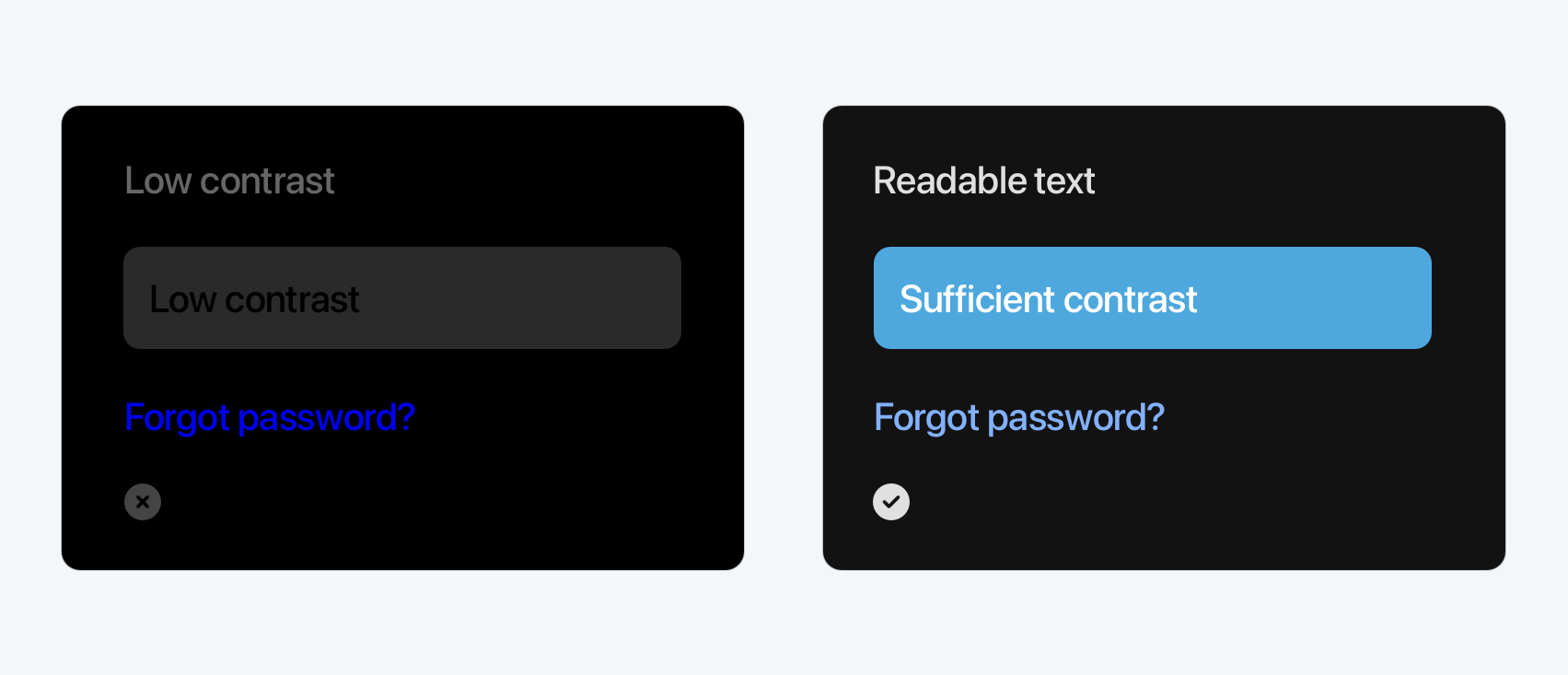
Color contrast & visual cues
Poor color contrast is one of the most common accessibility issues, and one of the easiest to fix. Poor contrast makes content hard to read for everyone, not just users with low vision.
To ensure good color contrast:
- Follow the WCAG contrast ratio guidelines on level AA:
- 4.5:1 minimum for normal text
- 3:1 for large text (18pt or bold 14pt)
- 3:1 for non-text UI components (icons, borders, etc.)
- Don't rely on color alone to convey meaning
- Avoid hard-to-distinguish combos (e.g. red/green or blue/purple)
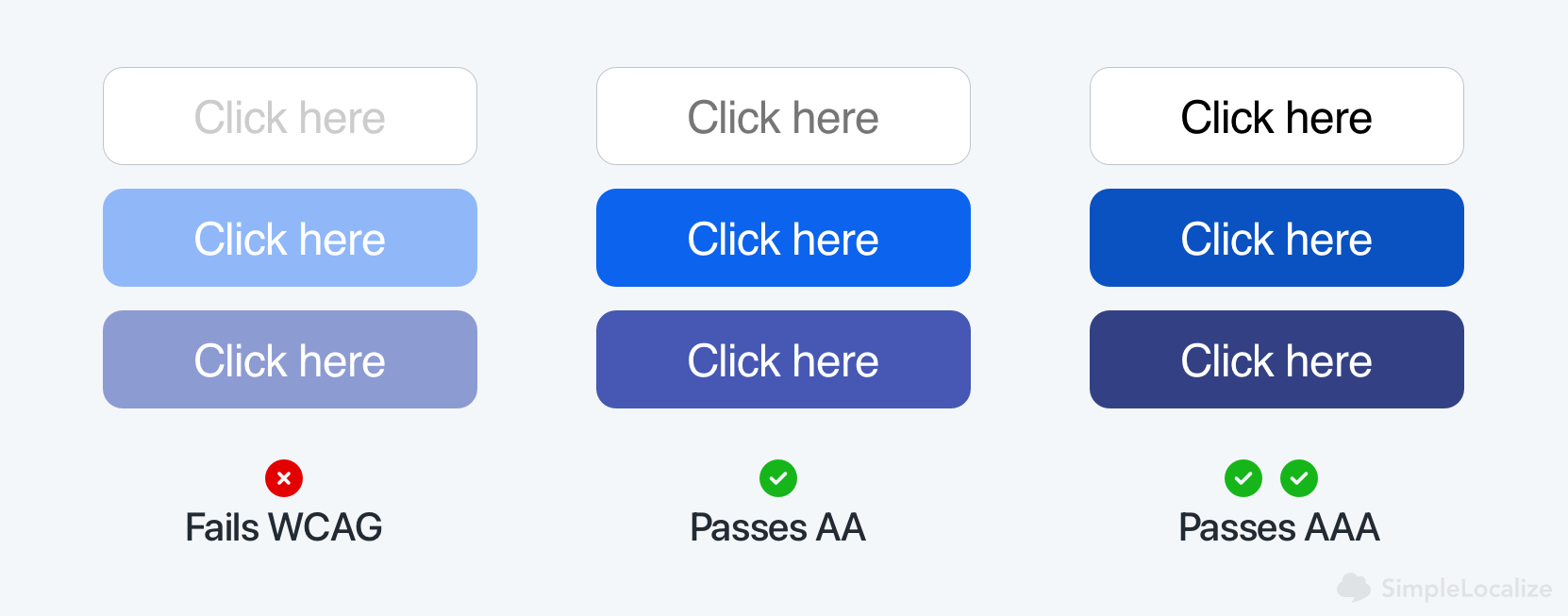
For perfect AAA compliance, use a contrast ratio of 7:1 for normal text and 4.5:1 for large text. But AA compliance is often sufficient for most applications.
Color accessibility tools:
- WebAIM Contrast Checker: Simply input foreground and background colors to check their contrast ratio.
- Lighthouse: Built-in accessibility audits in Chrome's tool to check color contrast issues on your site.
- Accessible Colors: A simple tool to test color combinations for accessibility.
Typography & text structure
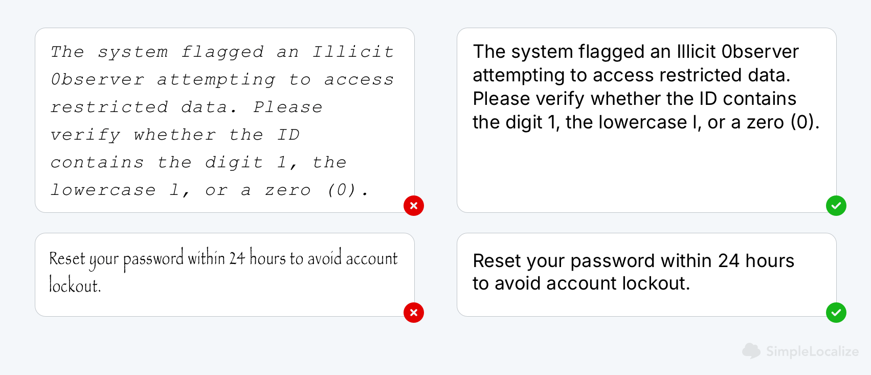
Good typography is more than just aesthetics. It affects how quickly and comfortably users can read your content, especially for those with dyslexia or cognitive impairments.
Best practices:
- Stick to clean sans-serif and readable typefaces.
- Font size should be at least 12pt (16px) for body text, with larger sizes for headings.
- Maintain line height of 1.5x and generous spacing.
- Limit font styles and varieties.
- Limit use of all-caps and ultra-light font weights.
- Avoid dense blocks of text. Use spacing, paragraph breaks, and bullet lists.
Also, use semantic HTML to structure your content and clear heading hierarchy: <h1> → <h2> → <h3>, without skipping levels. Instead of styling elements with CSS, use HTML (for example, <strong> for important text instead of just making it bold with CSS). This helps screen readers understand the content structure and improves SEO.
Test legibility with the phrase "Illicit 0bserver in COde 8uilding" to spot fonts that confuse characters like I, l, 0, and O.
Images, icons, and alt text
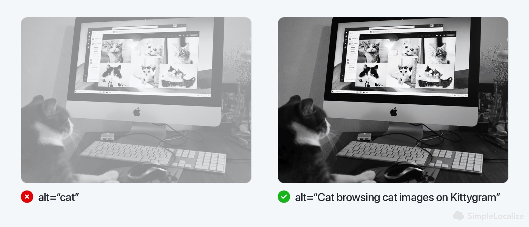
Images must be readable to all users, including those using screen readers. Decorative visuals should not distract from the content, while informative images should enhance understanding.
To make your images accessible:
- Use descriptive alt text for all meaningful images. Alt text should convey the purpose and content of the image, not just its appearance.
- Use
role="presentation"or emptyalt=""for decorative images.
<!-- Informative image -->
<img src="team.jpg" alt="Our customer support team at work" />

<!-- Decorative image -->
<img src="divider.svg" alt="" role="presentation" />
- Avoid using images of text. Instead, use CSS for text styling. If you must use text in an image, provide a text alternative in the
altattribute. - Ensure icons have clear labels using
aria-labeloraria-labelledbyattributes.
<button aria-label="Search">
  <svg>...</svg>
</button>
Aria-labels are used to provide additional context for screen readers. For example, if you have a button with an icon but no text, you can use
aria-labelto describe its function.
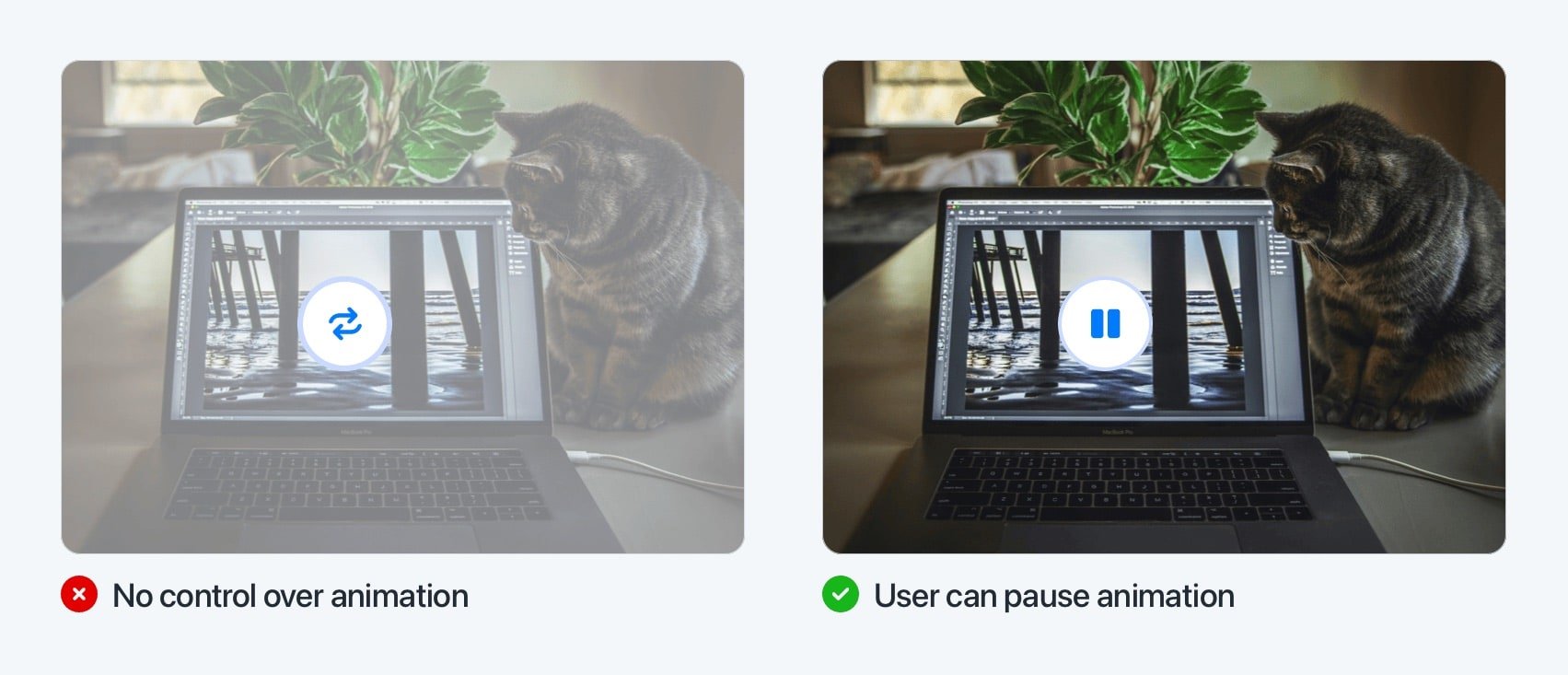
Animation & motion preferences
Motion should enhance, not distract. Some users may find animations disorienting or triggering, making it crucial to provide options for reduced motion.
To make animations accessible:
- Avoid flashing elements or autoplay effects. Animations that flash more than three times in one second can trigger seizures in users with photosensitive epilepsy.
- Respect users who prefer reduced motion nad provide a way to disable animations or reduce motion effects.
- Use animations to enhance understanding, not distract. For example, use subtle transitions to indicate changes in state (like a button press) rather than flashy effects that draw attention away from the content.
- Offer static alternatives when animation is essential.
The prefers-reduced-motion media query detects user preferences for reduced motion. You can use it to apply styles that respect these preferences:
@media (prefers-reduced-motion: reduce) {
  /* Apply reduced motion styles here */
  .animated-element {
    animation: none !important; /* Disable animations */
    transition: none !important; /* Disable transitions */
  }
}
Keyboard navigation
Not everyone uses a mouse. Keyboard accessibility benefits everyone, from power users to people with motor disabilities.
To ensure keyboard accessibility:
- All interactive elements must be reachable with Tab, Enter, Space, and arrow keys. This includes links, buttons, form fields, and custom controls.
- Ensure that the tab order is logical and intuitive.
- Use visible
:focusstyles to show which element is selected.
/* Example focus style */
button:focus,
input:focus {
  outline: 2px solid #005fcc; /* High contrast focus outline */
  outline-offset: 2px; /* Space between outline and element */
}
Pro Tip: Use the
tabindexattribute to control the tab order of elements. Usetabindex="0"for elements that should be focusable in the natural tab order, andtabindex="-1"for elements that should not be focusable.
At SimpleLocalize, we ensure that all our UI components are keyboard-navigable. For example, our translation editor allows users to navigate through translation entries using the keyboard. Check our our blog post on using translation editor keyboard shortcuts for more tips.
Forms and error handling
Forms are common points of failure in accessibility, especially if they are not properly labeled or do not provide clear feedback.

To make forms accessible:
- Use semantic HTML for form elements:
<label>elements associate labels with form controls. - Placeholders should not replace labels. They disappear when the user starts typing, which can be confusing.
- Clearly identify required fields. Mark them with
aria-required="true"and provide clear instructions for optional fields. - Use
aria-describedbyto link inputs to error messages and instructions. - Provide real-time validation and error messages that are clear and actionable. Use
aria-liveregions to announce errors without disrupting the user's flow.
<label for="email">Email address</label>
<input type="email" id="email" name="email" required aria-required="true" />
<span id="emailError" class="error" aria-live="assertive">Please enter a valid email.</span>
Dark mode
Dark mode isn't just a UI trend. It reduces eye strain and improves readability for many users. Dark mode is often preferred in low-light environments or by users with light sensitivity.
Make it accessible:
- Use a high contrast ratio between text and background. Don't just invert colors; ensure legibility is preserved in both light and dark themes.
- Avoid pure black (
#000000) against pure white (#FFFFFF), which can create harsh visual edges. Instead, use softer shades like#121212and#F5F5F5to reduce eye strain. - Make sure all UI states (hover, focus, disabled) are still visually distinct in dark mode.
- Test color accessibility in both light and dark themes. A color combination that passes WCAG in one mode may fail in the other.
- Respect system preferences with the
prefers-color-scheme mediaquery. It automatically applies the user's preferred color scheme based on their operating system settings.
@media (prefers-color-scheme: dark) {
  body {
    background-color: #121212;
    color: #E0E0E0;
  }
}
Pro Tip: Allow users to manually toggle between light and dark modes. Not everyone wants their system setting to dictate how your UI looks.
Also consider giving users custom color settings, such as:
- A high-contrast color theme
- Dyslexia-friendly text colors
- Option to reduce visual clutter by simplifying palettes
These small customizations can make a big difference, especially for neurodiverse users, users with low vision, migraine, or other conditions that affect how they perceive color and contrast.
Accessibility & Localization
Accessibility isn't just visual. Language is one of the biggest accessibility barriers on the web today.
Even well-designed UIs can become confusing if the translation is unclear, machine-generated, or culturally off. That is why accessibility and localization go hand-in-hand.
Effective localization goes beyond simple translation:
- Use the correct
langattribute on your pages and elements. - Don't rely solely on machine translation. It often misses context and can result in confusing or misleading labels.
- Check your translated UI. For example, a "Sign In" button translated into Polish might say something correct grammatically, but completely fail to convey what the button actually does.
- Use ARIA labels with translated text in components.
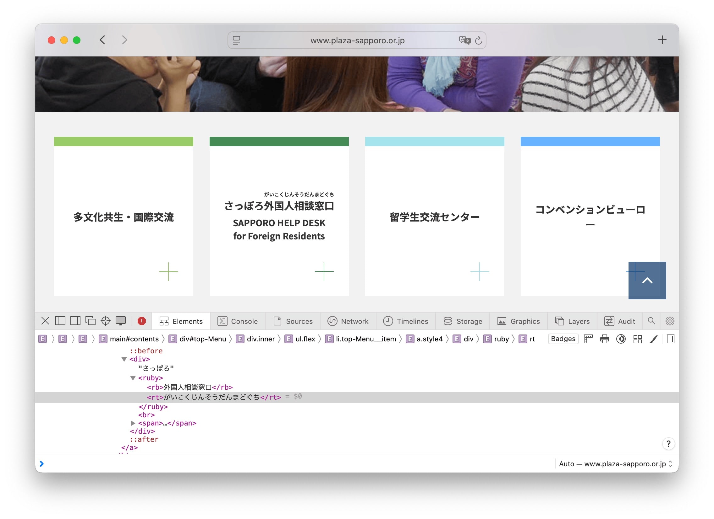
- Support writing systems properly. Some languages like Japanese use multiple alphabets. HTML's
<ruby>tag can help show pronunciation aids (furigana), which are especially useful for younger users or learners.
<!-- Example of using ruby for Japanese text -->
<p>
  <ruby>東京<rt>Tōkyō</rt></ruby>
</p>
At SimpleLocalize, we believe accessibility and localization go hand in hand. If your app supports multiple languages but the translated version is broken, confusing, or unreadable, it's not accessible.
WCAG: The standard for web accessibility
The Web Content Accessibility Guidelines (WCAG), created by the W3C define how to make the web accessible to people with a wide range of disabilities.
At the core of WCAG are four foundational principles, known as POUR:
- Perceivable: Users must be able to perceive content (e.g., using text alt for images, captions for videos).
- Operable: Interface elements must be usable via keyboard or assistive tools (accessible forms, clear navigation).
- Understandable: Content should be predictable and readable (simple language, consistent layout).
- Robust: Works across different browsers and assistive technologies (valid HTML, use of ARIA roles).

WCAG levels of conformance
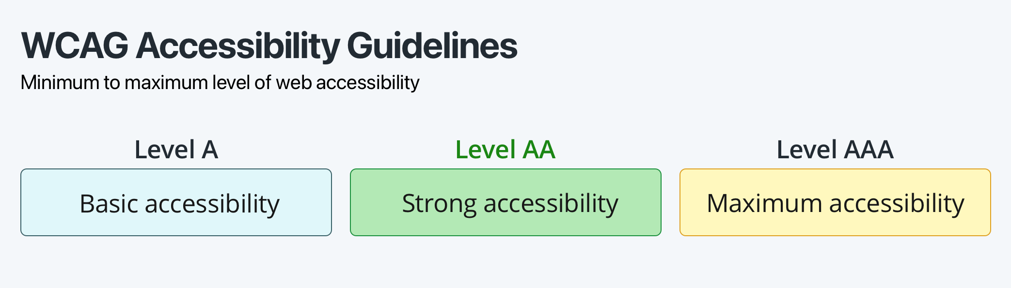
WCAG defines three levels of conformance:
- Level A: The minimum level of accessibility which includes basic requirements like providing text alternatives for images and videos, keyboard navigation, basic forms accessibility, and ensuring that content is readable and understandable.
- Level AA: The strong level of accessibility that includes all Level A requirements plus additional criteria like color contrast, more advanced form accessibility, and ensuring that content is navigable and understandable for users with various disabilities.
- Level AAA: The highest level of accessibility. This level is often not feasible for all content, but it is the ideal goal for maximum accessibility.
Level AA should be your target for most websites, as it balances accessibility with practical implementation. It includes requirements mentioned earlier, such as color contrast, text alternatives for images, and keyboard navigation.
WCAG Level AA compliance checklist
Use this checklist as a quick reference to ensure your website meets WCAG 2.1 Level AA accessibility standards:
Perceivable
- Text alternatives: Provide descriptive alt text (≤ 125 characters) for all non-text content, including images, charts, and videos.
- Color contrast: Maintain a contrast ratio of at least 4.5:1 for normal text and 3:1 for large or bold text.
- Multimedia alternatives: Include captions for audio, transcripts for video, and audio descriptions where necessary.
- Zoom and resizing: Ensure content can be resized up to 200% without loss of functionality or content.
- Responsive design: Design layouts that adapt smoothly across different screen sizes and orientations.
Operable
- Keyboard accessibility: All functionality must be available via keyboard alone, without requiring a mouse.
- Focus visibility: Use visible focus indicators on all interactive elements (e.g., links, buttons).
- Navigation aids: Provide mechanisms such as skip links, consistent menus, and breadcrumbs for easier navigation.
- Consistent navigation: Ensure navigation structure and placement are consistent across pages.
- Avoid time limits: Do not impose time limits unless necessary; if unavoidable, offer controls to extend or disable them.
- Motion and animation: Avoid excessive animation and allow users to reduce or disable motion effects. Never use flashing content that blinks more than 3 times per second.
- Gesture-based navigation: Ensure that all functionality is available without requiring complex gestures (e.g., pinch-to-zoom).
Understandable
- Clear headings and labels: Use descriptive headings and labels for all content, including forms and buttons.
- Readable text: Write in plain language, avoiding jargon, long sentences, or complex terms.
- Error identification: Clearly identify errors in forms and provide suggestions for correction.
- Error prevention: Provide users with the ability to review, correct, and confirm before finalizing actions (e.g., submitting forms).
- Accessible forms: Ensure all form fields have labels and clear instructions; group related elements logically.
- New windows: Warn users when links open in a new window/tab (e.g., with text or an icon).
Robust
- Accessible tables: Use semantic HTML (
<th>,<caption>,<scope>) so screen readers interpret tables correctly. - Downloadable content: Make PDFs and other files accessible, and indicate file type and size in the link text.
- Sitemap or search: Offer a site search or sitemap to help users locate content efficiently.
- CAPTCHA alternatives: Provide accessible alternatives (e.g., logic puzzles, email verification) for users who cannot complete traditional CAPTCHA challenges.
Practical UX tips for an accessible experience
Accessibility is not just a checklist—it's a mindset and a habit. It becomes far more effective when it's baked into your team's daily processes, tools, and collaboration.
Build accessibility into your design system
A shared design system is a powerful tool for scaling accessibility:
- Use accessible components by default: buttons with clear focus states, properly labeled form fields, contrast-compliant colors.
- Include ARIA guidelines and accessibility usage tips directly in design specs (e.g., in Figma or Sketch).
- Provide designers with an approved color palette that meets WCAG contrast ratios.
- Create reusable patterns (e.g., skip links, modals, alerts) that are already tested for accessibility.
Use SimpleLocalize's plugin for Figma to make sure translations are accessible right from the design stage. It allows you to manage translations and ensure that texts are displayed correctly in your designs in different languages.
Collaborate across roles
Accessibility isn't just a developer's job. It works best when everyone on the team shares the responsibility:
- Designers should plan for keyboard navigation, clear labels, and scalable typography.
- Copywriters can use plain, concise language and avoid ambiguous labels like “Click here.”
- Translators should ensure that translated content is clear and contextually appropriate.
- Developers should structure HTML semantically and use ARIA thoughtfully, only when needed.
- Testers/QA should include assistive tech testing (e.g., screen reader basics, keyboard-only nav) in standard test cases.
Test with real assistive technologies
Automated tools can catch many issues, but real-world testing is where accessibility wins:
- Try your website with a screen reader like NVDA, VoiceOver, or TalkBack.
- Navigate your app using only the keyboard, no mouse or trackpad.
- Check your layout and interactions in high contrast mode and with zoom enabled.
- Observe how your UI behaves with
prefers-reduced-motionandprefers-color-schemeenabled.
Even just a few minutes of testing with these tools can reveal major usability issues you wouldn't catch otherwise. Start with the most critical user flows, like logging in, filling out forms, and navigating key pages.
Create an accessibility checklist that fits your stack
Having a shared, realistic checklist can help your team catch issues early:
- Are headings structured semantically?
- Can all interactions be completed without a mouse?
- Are all images and icons properly labeled with alt text?
- Do all form fields have associated labels?
- Do form errors have clear, accessible feedback?
- Are language attributes (lang) applied correctly?
- Are animations and dark mode tested for clarity and comfort?
Integrate accessibility checks into code reviews, design QA, and even CI pipelines using tools like:
Think content-first, not color-first
Accessible design starts with clear communication, not just compliance:
- Write UI text that's action-oriented and unambiguous.
- Avoid vague phrases like "Learn more" or "Submit."
- Give users enough context to understand links, buttons, and instructions, especially in translated content.
Tip: Involve localization reviewers early to ensure translated UI strings remain clear and accessible in every supported language. Check out our guide on how to control the quality of your translations using the review status.
Conclusion
Website accessibility isn't a feature—it's a foundation. It improves SEO, enhances usability, and opens your product to a broader, more diverse audience. Whether you're building a dashboard, an e-commerce site, or a mobile app, inclusive design begins with inclusive communication.
Start small: fix contrast, structure your headings, and test with a screen reader. Over time, build accessibility into your workflow, not as an afterthought, but as a default.


