How to create a language selector with Tailwind CSS
If you want to jump straight to the code, you can find it on GitHub, and the most important part is in the src/components/LanguageSelector.tsx. However, we recommend reading the whole article to understand how building a language selector works. Language selector design — including locale detection, flag handling, and accessibility — is part of the broader i18n UI patterns covered in our complete technical guide to internationalization and software localization.
The article assumes that you have some basic knowledge of React and Tailwind CSS. We also assume that you already configured Next.js, Tailwind, and any internationalization library in your project.
For a very long time, SimpleLocalize was not showing flags next to languages in our languages' lists because we wanted to avoid making it wrong. We did not want to assume that a language is always associated with a country. However, eventually, we have decided that flags are a must because they highly improve user experience and translation performance; it is far easier to just look at the flag and determine the language this way instead of reading the language name.
Recently, we also started getting many requests from our users to add flags to the Translation Hosting or add an option to download them, mostly for the need of using them in language selectors. In response, we would like to share our solution. We are going to show you how to create a language selector with flags using Tailwind CSS.
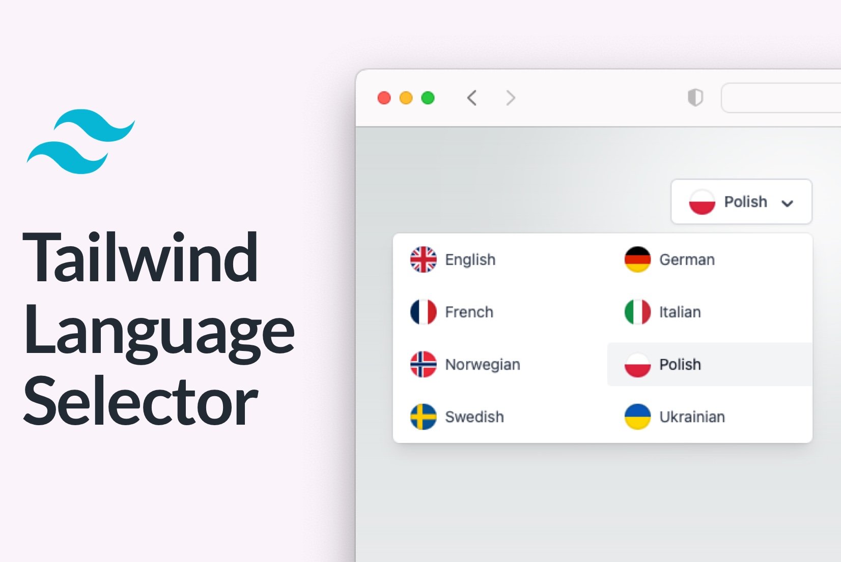
What are we going to build?
We will create a language selector that allows users to switch between different languages. The language selector will be a dropdown that will show a flag next to each language. For that purpose, we will use Tailwind as CSS framework, Next.js as a React framework, react-i18next package for translations of our mini app, and flag-icons package for flags.
Get country flags
We will start by creating a component that will display a flag for a given country. We will use the lipis/flag-icons package to show flags.
First, install the package using npm or yarn.
npm install -s flag-icons
Let's now import the CSS in _app.tsx from the node_modules and we are ready to use the flags.
import "node_modules/flag-icons/css/flag-icons.min.css";
The usage of the library is straightforward, and it looks as follows:
<span className="{`fi" fis fi-${countryCode}`} />
- Use the
ficlass to display a flag, - use the
fisclass to display a flag in a square, - and the
fi-{COUNTRY_CODE}class to display a flag for a given country.
{COUNTRY_CODE} is always a two-letter country code (ISO 3166), for example pl for Poland.
Letters are always lowercase. Below, you can see a list of all available country codes and their flags from the package.
See the full list of flags.
Build a language selector
Now that we have a component that displays a flag, we can create a language selector component.
We will use the useTranslation hook from the react-i18next package to get the list of languages and the current language.
const {i18n} = useTranslation();
const [isOpen, setIsOpen] = useState<boolean>(true);
const handleLanguageChange = async (language: Language) => {
    await i18n.changeLanguage(language.key);
    setIsOpen(false);
};
Fetch application languages
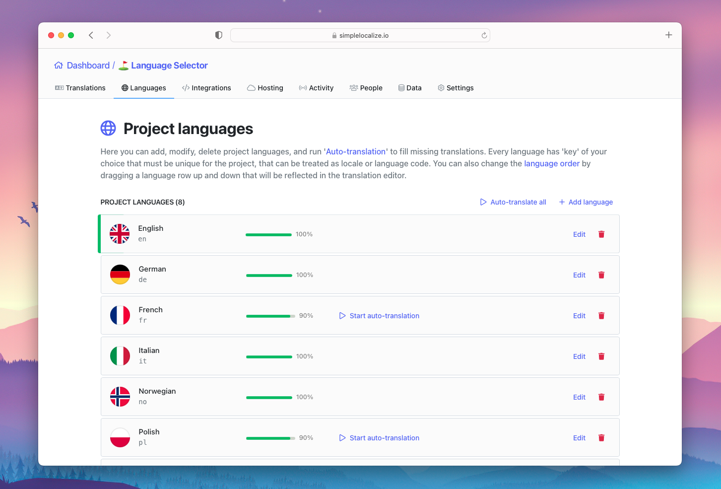
We will start by fetching the list of languages from the SimpleLocalize CDN. We will use the _languages endpoint to get the list of languages.
However, it is optional, as you can also hard-code the list of languages in your application.
    const [languages, setLanguages] = useState<Language[]>([]);
    useEffect(() => {
        const setupLanguages = async () => {
            const appLanguages = await fetch("https://cdn.simplelocalize.io/{YOUR_PROJECT_TOKEN}/_latest/_languages").then(response => response.json());
            setLanguages(appLanguages);
        };
        setupLanguages();
    }, []);
Let us create a new state variable called languages and use useEffect hook to fetch a list of available languages from the CDN using fetch API.
But you can use any other HTTP client library you prefer, like axios, superagent or useQuery.
Configure outside click handler
Whenever we click outside the language selector, we want to close it. We will use the useEffect hook to add a click handler to the window object.
    const LANGUAGE_SELECTOR_ID = 'language-selector';
    useEffect(() => {
        const handleWindowClick = (event: any) => {
            const target = event.target.closest('button');
            if (target && target.id === LANGUAGE_SELECTOR_ID) {
                return;
            }
            setIsOpen(false);
        }
        window.addEventListener('click', handleWindowClick)
        return () => {
            window.removeEventListener('click', handleWindowClick);
        }
    }, []);
In this example, we use the closest method to find the closest parent element that matches the selector.
Add selected language button
Now that we have all the necessary data, we can create the language selector. We will start by creating a button that will display the selected language.
We will use i18n.language to get the currently selected language for the app to find the language object for the selected language key.
Language object will be used to display the flag and the name of the language.
const {i18n} = useTranslation();
const selectedLanguage = languages.find(language => language.key === i18n.language);
// ...

<button
    onClick={() => setIsOpen(!isOpen)}
    type="button"
    className="inline-flex items-center justify-center w-full rounded-md border border-gray-300 shadow-sm px-4 py-2 bg-white text-sm font-medium text-gray-700 hover:bg-gray-50 focus:outline-none focus:ring-2 focus:ring-offset-2 focus:ring-indigo-500"
    id={LANGUAGE_SELECTOR_ID}
    aria-expanded={isOpen}
>
    <FlagIcon countryCode={selectedLanguage.key}/>
    {selectedLanguage.name}
    <svg
        className="-me-1 ms-2 h-5 w-5"
        xmlns="http://www.w3.org/2000/svg"
        viewBox="0 0 20 20"
        fill="currentColor"
        aria-hidden="true"
    >
        <path
            fillRule="evenodd"
            d="M10.293 14.707a1 1 0 01-1.414 0l-4-4a1 1 0 011.414-1.414L10 12.586l3.293-3.293a1 1 0 011.414 1.414l-4 4z"
            clipRule="evenodd"
        />
    </svg>
</button>
FlagIconcomponent is a wrapper around thespanelement that displays the flag. It's useful because we can override a flag for a given language.- The
svgelement is used to display the chevron icon that indicates whether the dropdown is open or not. You can extract it later into a separate component or use any other icon of your preference. onClickhandler will toggle the dropdown.idattribute will be used to identify the button for the outside click handler.
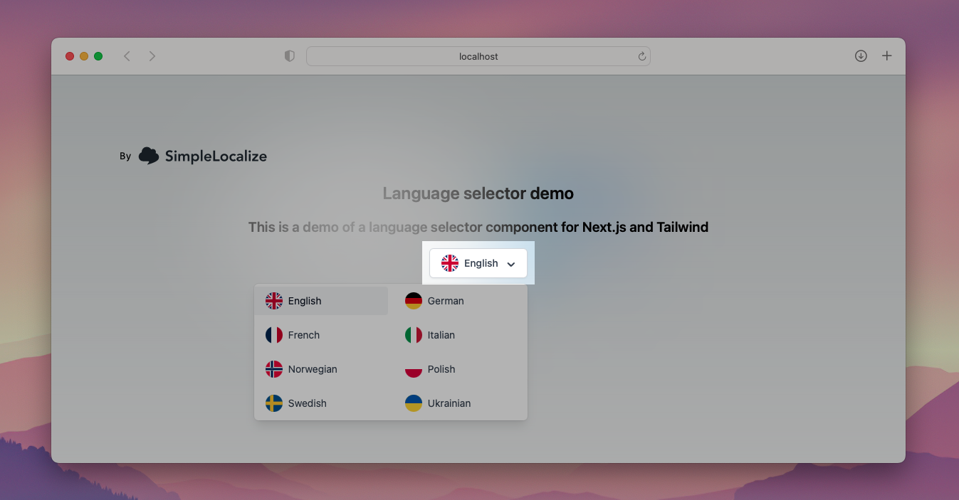
Add language selector dropdown
Now we can create the language selector dropdown that will appear when isOpen state is set to true and load inside the list of languages based on the languages state variable.
We used grid grid-cols-2 gap-2 classes to display the list of languages in two columns.
We also used rounded-r and rounded-l classes to round the corners of right and left language entries.
{isOpen && <div
    className="origin-top-right absolute right-0 mt-2 w-96 rounded-md shadow-lg bg-white ring-1 ring-black ring-opacity-5"
    role="menu"
    aria-orientation="vertical"
    aria-labelledby={LANGUAGE_SELECTOR_ID}
>
    <div className="py-1 grid grid-cols-2 gap-2" role="none">
        {languages.map((language, index) => {
            return (
                <button
                    key={language.key}
                    onClick={() => handleLanguageChange(language)}
                    className={`${
                        selectedLanguage.key === language.key
                            ? "bg-gray-100 text-gray-900"
                            : "text-gray-700"
                    } block px-4 py-2 text-sm text-start items-center inline-flex hover:bg-gray-100 ${index % 2 === 0 ? 'rounded-r' : 'rounded-l'}`}
                    role="menuitem"
                >
                    <FlagIcon countryCode={language.key}/>
                    <span className="truncate">{language.name}</span>
                </button>
            );
        })}
    </div>
</div>}
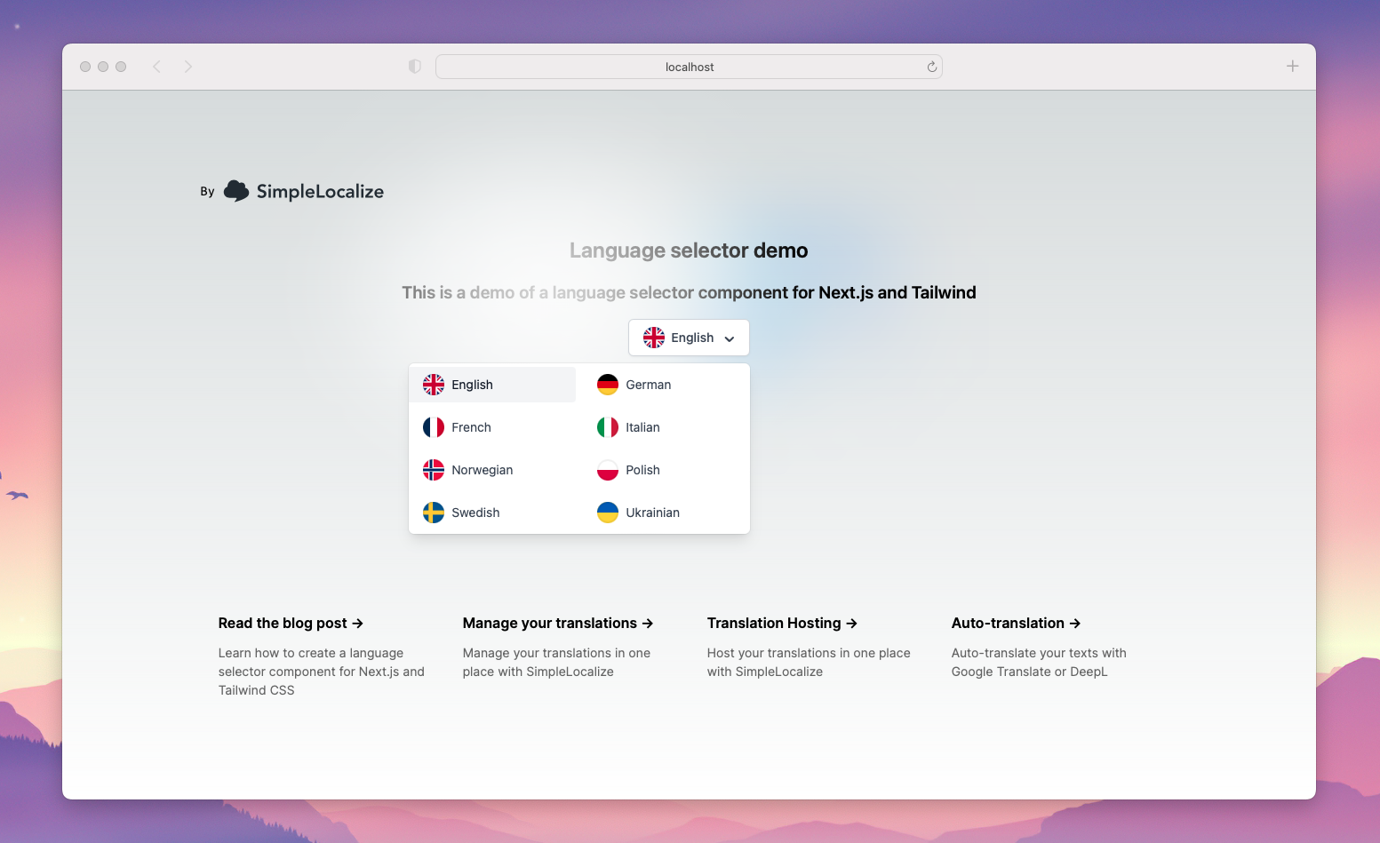
Ready to use language selector
In this tutorial, we created a language selector component that uses flags to represent languages.
We used the react-i18next package to get the list of languages, the current language and translate our mini application.
With those few steps, we created a language selector that can be used in any React application.
Our tips for creating a language selector
Building a language selector is not a trivial task. There are many things to consider, and we will share some of our tips that we learned while building many language selectors over the years.
Languages don't have flags
Remember that the country's flag might not be the best option to represent a language. For example, the flag of the United Kingdom is used to represent English, but it is also used to represent Welsh, Scottish Gaelic, and Cornish. However, flags are a good option if you plan to support only a few languages, so they will not overlap with the countries. They also look nice and are easy to understand.
Learn more about pros and cons of using flags in language selectors.
White parts of flags can be problematic
Some flags have a white part, which can be problematic when used on a light background. In this tutorial, we solved this by setting an inset border on the flag, to make it stand out from the background.
.fiCircle {
  width: 24px;
  height: 24px;
  font-size: 24px;
  border-radius: 100%;
  border: none;
  box-shadow: inset 0 0 0 2px rgba(0, 0, 0, .06);
  background: white;
}
The inset border is a box-shadow property, which makes it appear inside the element.
Look how the Polish, French and Italian flags are looking with and without the inset border.
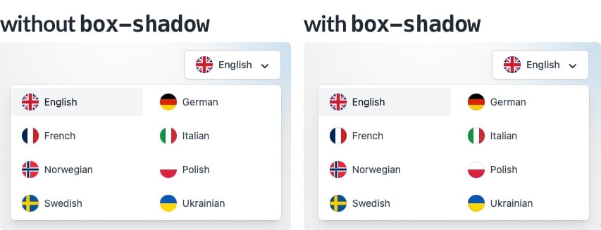
It will make the white part stand out from the background and will not affect the rest of our flags significantly.
Complex flags in small sizes might look bad
Some flags are more complex than others. For example, the flag of Spain has a coat of arms in the middle.
In this case, we can use a simple trick to make it look good. We can use a background-size property to make the flag smaller.
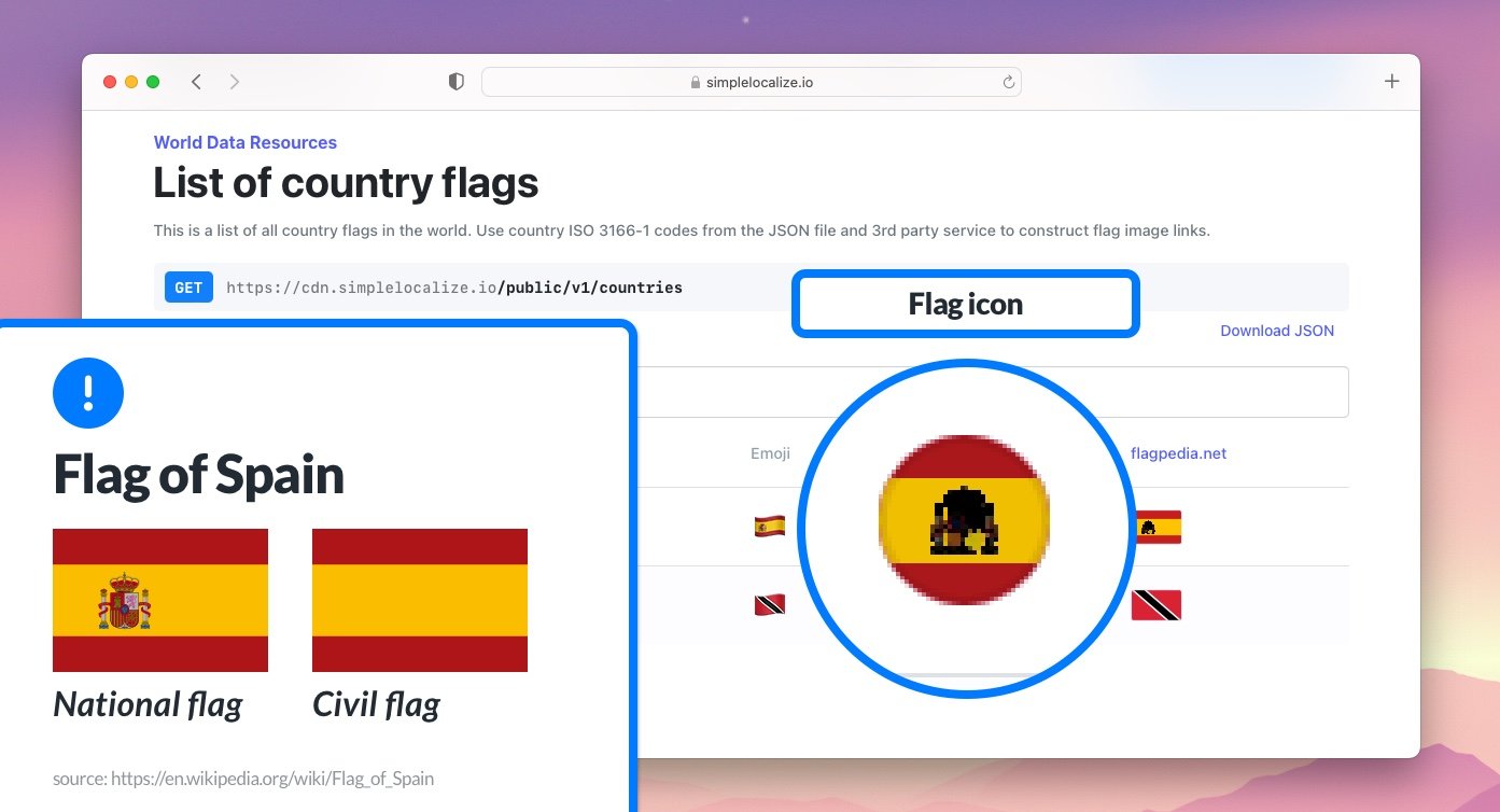
In small sizes, the coat of arms is not visible, and it does not look as good as other flags. All flags are in SVG format, so we can adjust them to our needs. But note that altering flags is not always a good idea because it can be considered as a violation of the flag code.
Country codes are always lowercase
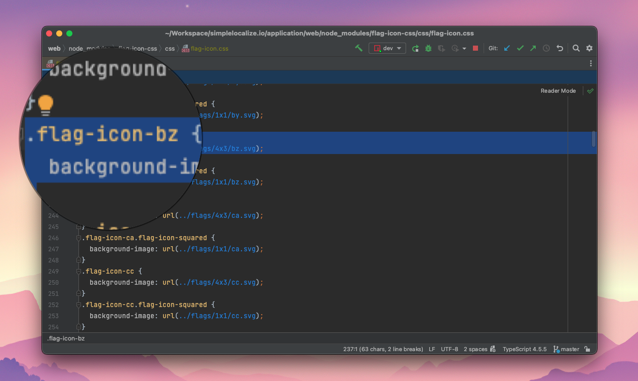
Country codes are always lowercase. This is important because flag-icons package uses lowercase country codes in the CSS class names. Remembering about this can save you a lot of time because you will not have to debug why your flags are not showing up. 😉
More language selector inspiration
If you are looking for real-world inspiration or want to explore different UX patterns and design approaches, check out our curated guide:
I hope this tutorial was helpful, and you learned something new. Thanks for reading!


