Design that speaks every language: UI tips for localization
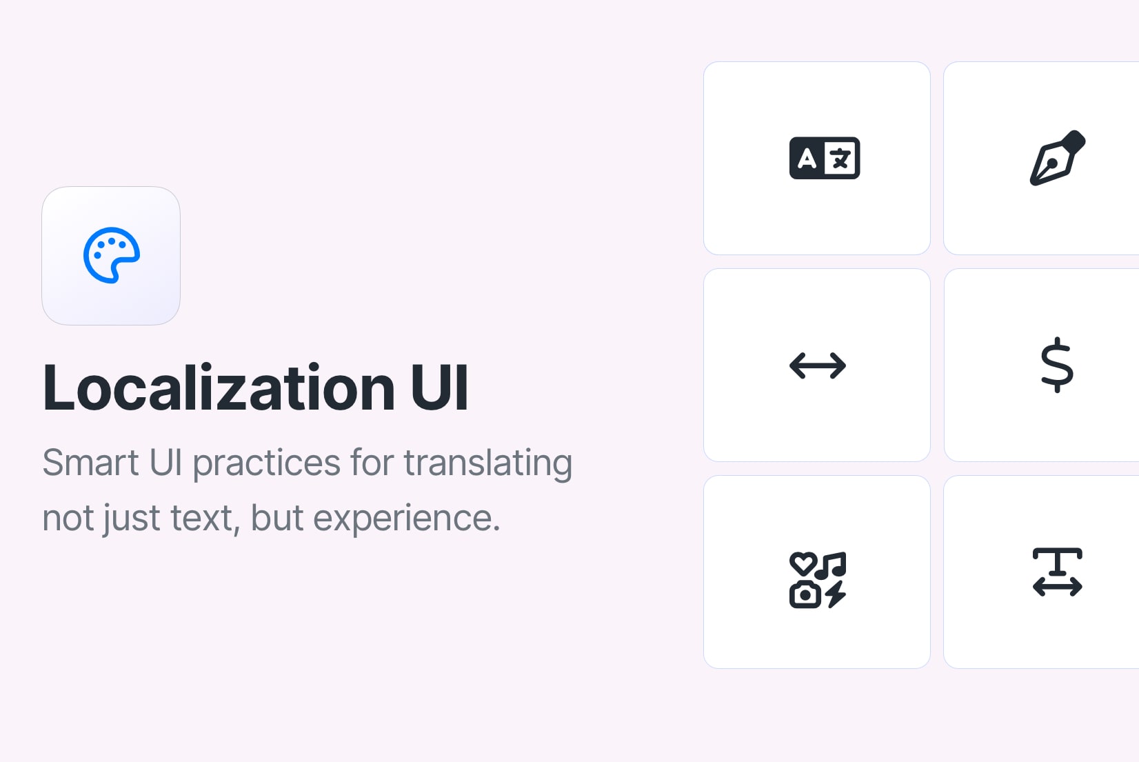
Localization is not only about reaching global audiences. It's about building comfort, clarity, and trust.
When users land on a page that reflects their language, cultural expectations, and formatting conventions, they feel at home. That sense of familiarity directly impacts engagement, activation, and retention.
But localization goes beyond translating strings. It shapes how people navigate your interface, interpret icons, complete forms, and even trust your product.
UI localization is the execution layer of your localization strategy.
It connects product design, engineering, SEO, and international growth.
If you haven't defined your markets, language rollout plan, or URL structure yet, start with our Ultimate Guide to Localization Strategy.
Language vs. locale: understand the difference
Before diving into UI decisions, it's important to understand the differences between language and locale.
- A language refers to the linguistic system (e.g., English, Spanish, Arabic).
- A locale includes language plus regional formatting and cultural conventions (e.g.,
en-USvsen-GB,pt-BRvspt-PT).

Why this matters for UI:
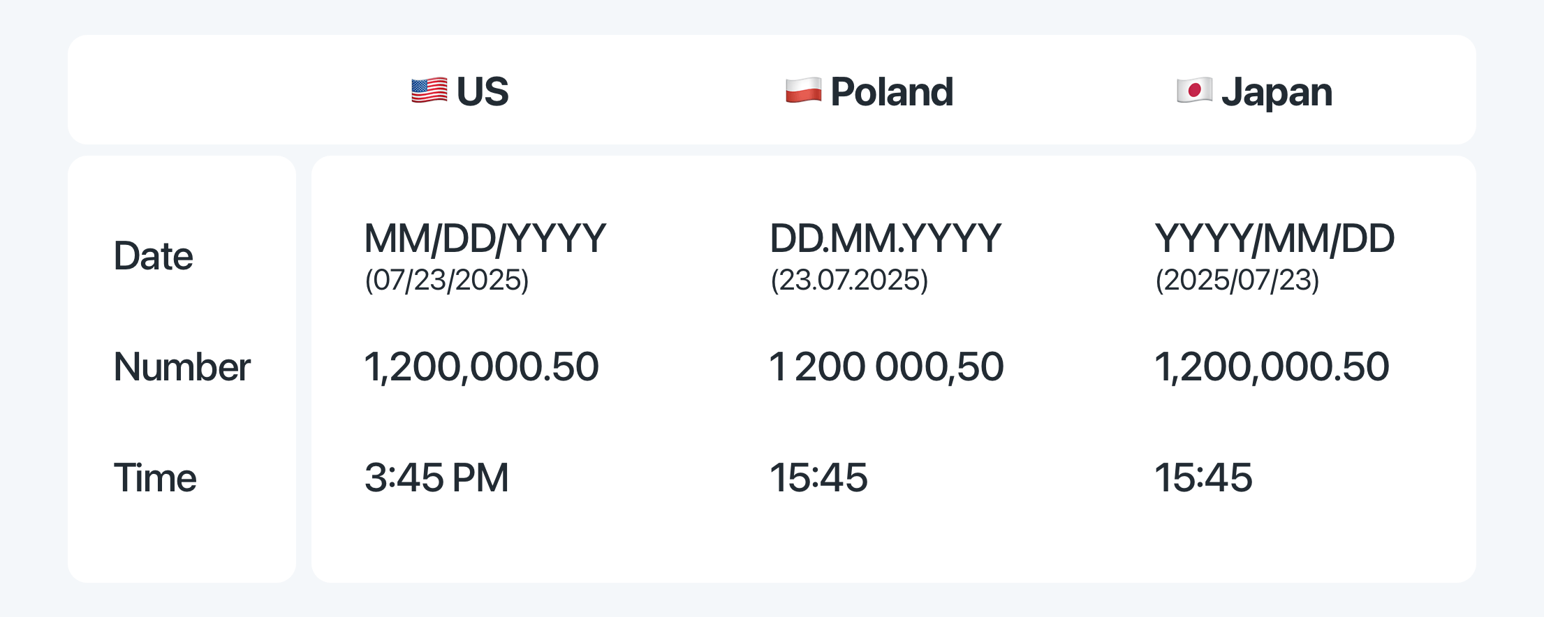
- Date format: 03/04/2026 means different things in US vs UK.
- Currency: $ vs A$ vs CA$.
- Measurement units: miles vs kilometers.
- Spelling and terminology differences.
Designing only for language without considering locale leads to subtle friction.
If you're structuring your app around locales, not just languages, your routing, formatting logic, and SEO setup must reflect that. We cover this deeper in our Localization and SEO best practices guide.
When should you prioritize UI localization?
UI localization becomes critical when:
- You expand into languages with significant text expansion (German, Finnish).
- You enter RTL markets like Arabic or Hebrew.
- Your localized markets show lower activation or conversion.
- You scale beyond 3-5 languages and layout issues compound.
- You implement multilingual SEO and drive traffic to localized landing pages.
If international growth is part of your roadmap, UI localization directly affects usability, retention, and revenue.
It must align with your broader localization strategy and your language rollout plan.
Language doesn't just change words, it changes space
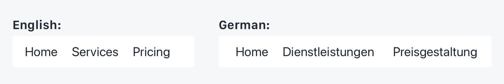
One of the first surprises in localization is text expansion.
- German strings can grow 30-50%.
- Finnish and Hungarian often expand significantly.
- English-to-Chinese can shrink visually but increase density.
Build flexible, responsive layouts that expand and contract with content naturally.
Avoid:
- Fixed-width buttons
- Hardcoded navigation containers
- Text embedded inside images
Instead:
- Use auto-resizing components
- Design with padding buffers
- Test with pseudo-localization
Tip: Try using the SimpleLocalize Figma plugin to test different languages in your UI mockups. It's a great way to spot layout issues early. Learn more about it in our Figma localization tutorial.
Layout and flow should follow the language
RTL support is not just about flipping text alignment.
Mirror navigation and content flow for RTL languages to match reading habits and user expectations.
For languages like Arabic and Hebrew, your entire layout logic must adapt:
- Navigation should mirror
- Progress indicators reverse direction
- Icons with directional meaning flip
- Carousels swipe correctly
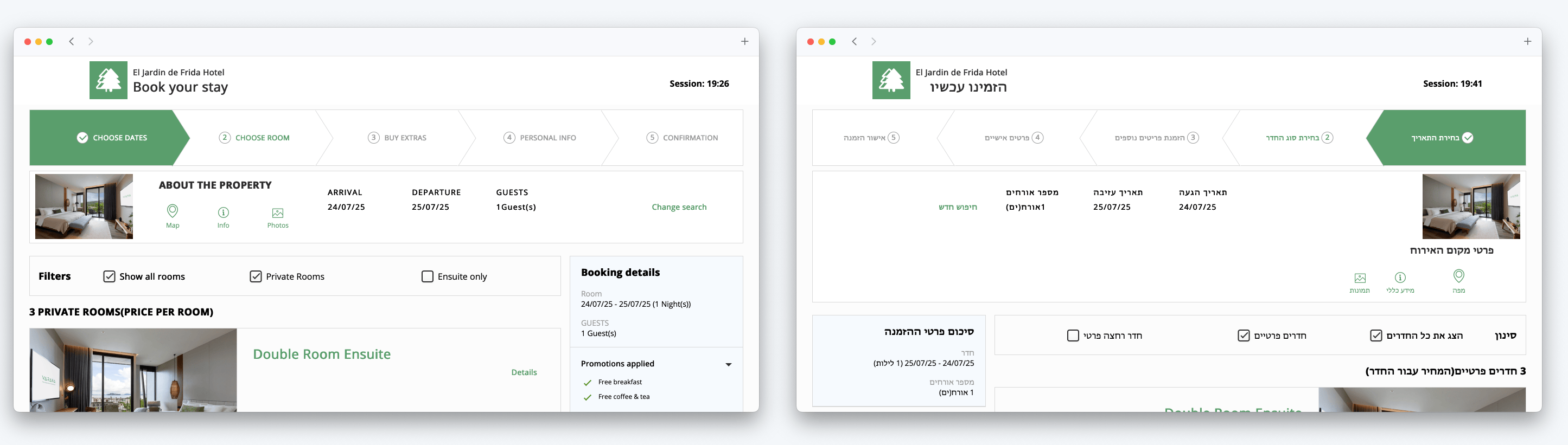
If your CSS and component logic assume LTR by default, your UI will feel broken in RTL contexts.
Proper RTL support should be implemented at the layout system level, not patched visually.
URLs and routing must reflect localization
UI localization doesn't stop at visuals. Your URL structure plays a critical role.
Best practices:
- Use subdirectories (example.com/de/) or subdomains (de.example.com)
- Avoid query parameters for primary language targeting (
?lang=de) - Keep locale consistent between UI and URL
- Implement proper hreflang tags
- Avoid forced IP-based redirects
Why this matters:
- Search engines need stable URLs per locale.
- Users need shareable, consistent localized links.
- Inconsistent routing breaks analytics and tracking.
If you're implementing multilingual routing, make sure your UI language switcher updates the URL accordingly.
Learn more about URL localization best practices.
Choose fonts that speak the script
Not all fonts are created equal. Some don't support Chinese characters, Cyrillic script, or accents used in Vietnamese. Others might render in a way that feels unbalanced or cramped in certain languages.
Pick fonts that support multilingual character sets and maintain readability across scripts.
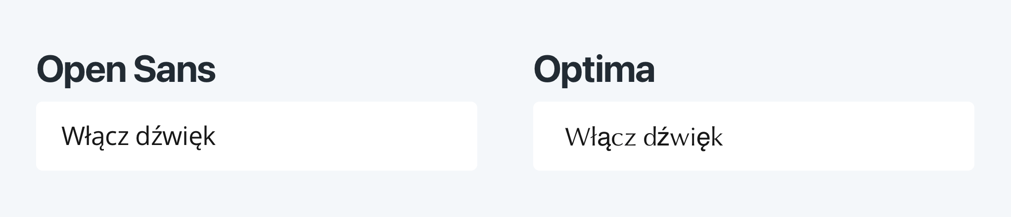
Good localization includes thoughtful typography. Choose fonts with wide language support, and test how they appear with your UI. Make sure they maintain readability and visual harmony, especially at smaller sizes or in complex interfaces.
Use system fonts where possible, as they often have better support for multiple languages and scripts.
Icons, symbols, and cultural context
A thumbs-up icon might seem universally positive, but that's not always the case. Colors like red or white carry different cultural meanings. Even an envelope icon for email may not hold the same meaning globally.
Choose visuals that are culturally appropriate or swap them out entirely for certain locales.
Localization isn't just about words. Visual elements carry cultural weight. It's worth reviewing icons, illustrations, and even emoji with cultural relevance in mind. Swapping out images to reflect local customs, currency, or attire can go a long way in making users feel like the product is truly for them.
Some examples of culturally sensitive icons include:
- A thumbs-up (👍) icon is positive in many Western cultures, but in some places, it can be offensive.
- A checkmark (✔️) might not be universally understood as "correct" or "approved"; in some cultures, e.g., in Sweden or Japan, it can signify "no" or "incorrect."
- A shopping cart icon might be replaced with a basket in some cultures.
- A calendar icon could be adjusted to reflect local holidays or date formats.
- A piggy bank icon for savings might not resonate in cultures where saving is represented differently.
- Color use: Red can signal danger in Western cultures, but in China, red symbolizes good luck and positivity. A red “error” message might feel unintentionally harsh in some locales.
- Navigation arrows might need to be flipped for RTL languages.
Formats, forms, and micro-details
Don't overlook the tiny UI elements, they matter more than you think. Date formats vary (MM/DD/YYYY vs DD/MM/YYYY), decimal points and thousands separators change by region, and name order isn't the same everywhere.
Adapt all small UI details, dates, numbers, names, addresses, to the user's locale, not your own.
Forms in particular need attention. Consider:
- Postal codes that don't use numbers
- Phone numbers with different country codes and formats
- Address structures that don't follow street-city-zip conventions
- Date formats that vary widely (e.g., 01/02/2023 vs 02/01/2023)
- Currency symbols that change placement (e.g., $100 vs 100€)
- Time formats that differ (12-hour vs 24-hour clocks)
- Units of measurement that vary (imperial vs metric)
- Gendered forms that require different translations or structures
- Pluralization rules that differ by language
Instead of hardcoding formatting logic, use locale-aware APIs (e.g., Intl in JavaScript) and structured locale files.
If your UI makes assumptions based on a single country or language, localized users will hit friction, and friction drives them away.
Check out our blog post on number formatting in JavaScript for more on handling numbers and dates in a localized way.
Language selection and user control
Instead of detecting language solely via IP:
- Respect browser preferences
- Allow manual override
- Store user selection persistently
- Avoid automatic redirect loops
Provide a clear language selector that respects user choice and allows easy switching.
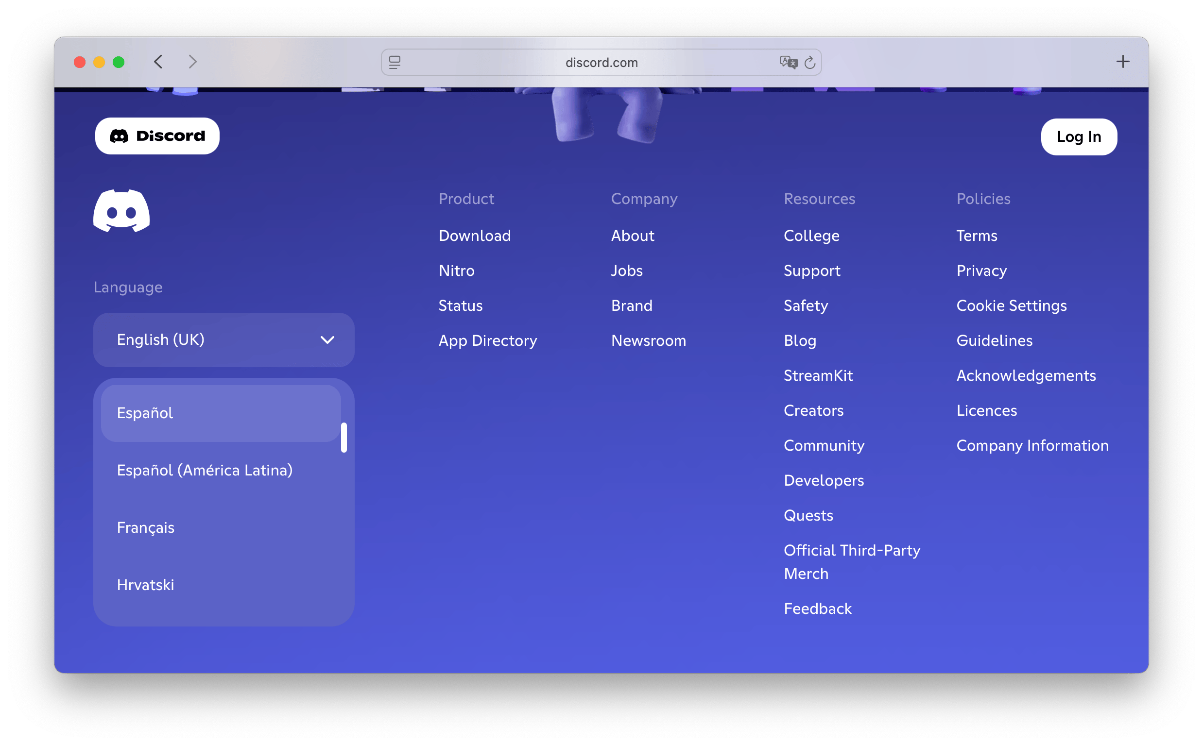
Make it easy for users to switch languages at any time. Place the language selector in a predictable location (header or footer) and label it in the native language (Deutsch, Español, العربية).
This not only respects their preferences but also allows them to explore your content in different languages, which can be a great learning experience.
Check out our examples of language selectors in popular apps for inspiration on how to implement this effectively.
Localization starts with preparation
The good news? Much of this can be handled proactively. Tools like SimpleLocalize help manage translations and make it easy to test different language versions in real context. But good localization starts even earlier, with how your UI is built.
Plan for localization early: externalize your strings, structure your UI for adaptability, and test often. For SaaS companies scaling internationally, these UI decisions directly affect activation and conversion. We break this down in our Localization strategy for global SaaS growth.
Make sure all translatable content is externalized. Use auto-resizing UI components. Build layouts that can flex. And always test each locale visually, not just in the code editor, but in the interface itself.
You can test translations directly on your website or app using the SimpleLocalize In-Context Editor. It allows you to see how translations look in real time, ensuring your UI feels right in every language.
Localization is a design process
Ultimately, localization is a design process. It's about empathy. You are not just translating, you are shaping an experience that feels familiar and intuitive to someone from a different culture, using a different script, thinking in a different language.
When localization is done well, it doesn't feel like translation, it feels like home.
The best localized apps and websites don't feel like translations. They feel like they were built right there, by someone who knows the user well. That's what makes the difference, and that's what good UI localization should aim for.
For more on localization best practices, check out our Localization Best Practices Guide.
UI localization and multilingual SEO
UI decisions affect more than design, they influence:
- Crawlability
- Duplicate content
- Indexing
- Conversion rates
Hardcoded text, improper routing, or hidden localized content can undermine SEO.
If organic growth matters, UI and SEO must be aligned from the start.
Learn more about Localization and SEO best practices.
Quick recap: UI localization tips
Here's a quick recap of what to watch for when localizing UI:
- Design flexible layouts for content growth
- Support RTL languages with mirrored layouts
- Use fonts with wide language support
- Check icons and visuals for cultural meaning
- Format data like dates and numbers per locale
- Localize forms to match regional expectations
- Let your interface flex, don't hardcode size or content
- Test every language visually, not just technically
- Allow users to choose their language easily
- Use tools like SimpleLocalize to streamline the process
UI localization checklist
Use this checklist before shipping a new locale:
Layout & structure
- No fixed-width containers
- Buttons expand without truncation
- Text never overlaps icons
- No text embedded inside images
Direction & flow
- RTL layout fully mirrored
- Directional icons flipped
- Proper text alignment applied
Typography
- Font supports all required scripts
- Accents render correctly
- Line height works for complex scripts
Formatting
- Dates follow local format
- Currency symbol and placement correct
- Decimal and thousand separators correct
- Measurement units localized
Forms
- Address format matches local conventions
- Phone number validation locale-aware
- Gender/plural rules supported
- Error messages culturally appropriate
Technical
- All strings externalized for translation
- Locale reflected in URL
- hreflang tags implemented
- No forced IP redirects
- Language switch updates URL
Testing
- Visual QA completed per locale
- RTL tested manually
- Native speaker review completed
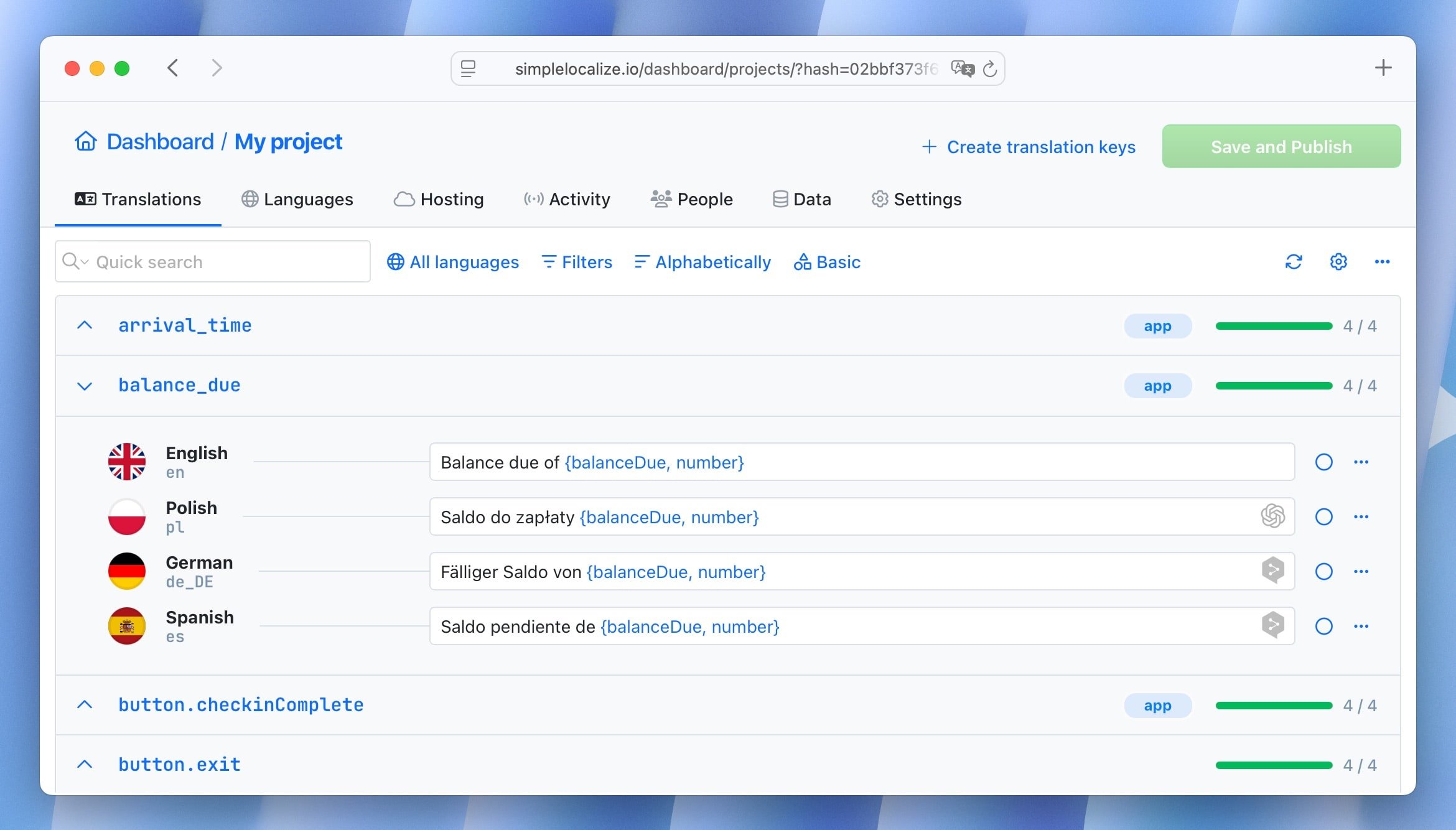
How SimpleLocalize helps with UI localization
SimpleLocalize is designed to make localization easier, especially for UI. Here are some ways it can help:
- Sync UI strings with Figma: Use our Figma plugin to pull text directly from your designs, ensuring your UI mockups reflect real translations.
- Test translations in real interface context: With our In-Context Editor, you can see how translations look directly on your website or app, allowing you to spot layout issues early.
- Automate workflows: Integrate with your development process to automatically update translations as your UI evolves, keeping everything in sync.
- Collaborate with translators: Provide translators with the context they need to deliver accurate translations that fit your UI.
- Validate visually before publishing: Ensure that your localized UI looks great and functions well before going live.
Conclusion
Localization is not just a checkbox, it's a commitment to your users. When you design with localization in mind, you create an interface that feels natural, intuitive, and welcoming to everyone, no matter where they are or what language they speak.
If you build your UI with localization in mind from the start, you are not just reaching more users, you are respecting them. And that's the kind of design that earns trust, loyalty, and love.


")
")
")